Screenshot style breakdown
Sampled from 5 of SiBa - Sicherheitsbarometer's App Store screenshots — background, accent and theme, measured by LaunchShots (not something Apple publishes).
#FCFCFC bg
#DDDDDD
#DCBC44 accent
#111111 text
Reading the caption text from the screenshots in your browser…
Screenshots


iPad screenshots

Icon palette
About this app
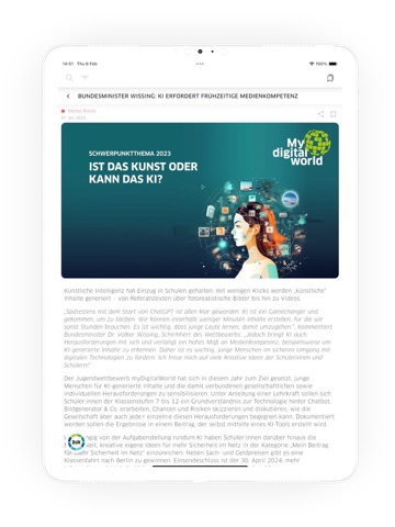
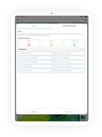
Medien warnen regelmäßig vor Sicherheitslücken oder Computerviren. Was für die eigene Situation wirklich relevant ist, können viele Verbraucher:innen und auch kleinere Betriebe allerdings oft schwer erkennen. Hier hilft das DsiN-Sicherheitsbarometer (SiBa), das es seit 2015 auch als kostenfreie Mobile App gibt. Die App informiert regelmäßig über aktuelle Phishing-Wellen, verbreitete Schadsoftware, kritische Sicherheitslücken und andere Bedrohungen der digitalen Sicherheit in verbreiteten Programmen und Diensten. Gleichzeitig stellt die App erste Handlungsempfehlungen und Sicherheitstipps bereit, damit sich Nutzer:innen selbst schützen können. Auf Wunsch informiert die App per Push über neue Meldungen. Mit verschiedenen Filtern lassen sich die Benachrichtigungen zudem auf spezielle Themenbereiche eingrenzen. Meldungen können auch direkt an Freunde und Bekannte weitergeleitet werden. …
App details
What you can learn from SiBa - Sicherheitsbarometer
Every shipping app on the App Store has gone through the same decisions you're working through right now: which screenshot goes first, what caption sits over it, which device frame to show, what color the background should be. The 8 screenshots above are SiBa - Sicherheitsbarometer's answers to those questions — they're public, they're real, and they made it through Apple's review.
What the numbers say: SiBa - Sicherheitsbarometer runs a light set where the background shifts from screenshot to screenshot (first shot #FCFCFC) — each image has to stand on its own, so the captions carry more of the story. The accent colour we picked up, #DCBC44, is the one to reuse for badges, arrows and highlighted words if you borrow this look. Hit Use this style to open the editor with these exact colours and drop your own screenshot in.
Notice the first screenshot in particular. It's the one users see in search results and on the product page, and it's where most apps spend their best caption and tightest design. Look at the proportion of background to phone, where the text sits, what one thing the image is trying to communicate.
Want to see how other News apps approach the same problem? Browse more News apps in the showcase.
Take what works into your own screenshots
Open LaunchShots and design your App Store & Google Play screenshots — pick a device frame, drop captions, ship in minutes. Free, in your browser.
Open the screenshot editor →Apps with a similar look
Closest background + accent colours among the listings we've analysed — useful when you want to see the same palette handled by a different team.