Chart position — tracked daily by LaunchShots
Screenshot style breakdown
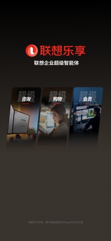
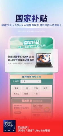
Sampled from 4 of 联想's App Store screenshots — background, accent and theme, measured by LaunchShots (not something Apple publishes).
#3C342C bg
#575049
#C4342C accent
#FFFFFF text
Screenshots


Icon palette
About this app
联想,是联想集团旗下联想官网的购物APP,致力于打造“一站式智慧生活购物平台”。为您提供联想笔记本电脑、手机、台式机、打印机、服务器、智能数码、周边选件、私人定制等商品在线购买及服务,同时提供新品资讯、会员福利、设备管理、服务咨询和测评种草等相关体验。 【特色产品和服务】 私人定制:专属定制,与众不同; 新品首发:小新笔记本、拯救者手机、摩托罗拉手机,新品抢先体验; 智选好物:好物精选,价格厚道、品质卓越; 联想直播:主播带你逛商城,超多宠粉福利; 品质保证:联想官网,正品保证。 【新鲜玩法福利多】 新人有礼:注册立享999元超值礼包,更有APP专享低价福利,乐豆购机可抵现5%; 学生专享:认证后,即可获得学生优惠大礼包; 会员福利:抢购机优惠,享乐豆兑换福利; 邀请有礼:邀请好友助力,有好礼相送! 社区发现:看评测,读百科,参与热门话题讨论,Get各种好物新玩法! 【官方客服】 联想服务热线:4000-888-222; ThinkPad服务热线:400-898-9006; 服务产品购买热线:400-890-1566; 智能电视咨询购买热线:400-100-5858
App details
What you can learn from 联想
Every shipping app on the App Store has gone through the same decisions you're working through right now: which screenshot goes first, what caption sits over it, which device frame to show, what color the background should be. The 4 screenshots above are 联想's answers to those questions — they're public, they're real, and they made it through Apple's review.
What the numbers say: 联想 runs a dark set where the background shifts from screenshot to screenshot (first shot #3C342C) — each image has to stand on its own, so the captions carry more of the story. The accent colour we picked up, #C4342C, is the one to reuse for badges, arrows and highlighted words if you borrow this look. Hit Use this style to open the editor with these exact colours and drop your own screenshot in.
Notice the first screenshot in particular. It's the one users see in search results and on the product page, and it's where most apps spend their best caption and tightest design. Look at the proportion of background to phone, where the text sits, what one thing the image is trying to communicate.
Want to see how other Productivity apps approach the same problem? Browse more Productivity apps in the showcase.
Take what works into your own screenshots
Open LaunchShots and design your App Store & Google Play screenshots — pick a device frame, drop captions, ship in minutes. Free, in your browser.
Open the screenshot editor →Apps with a similar look
Closest background + accent colours among the listings we've analysed — useful when you want to see the same palette handled by a different team.