Chart position — tracked daily by LaunchShots
Screenshot style breakdown
Sampled from 6 of BravoBravo's App Store screenshots — background, accent and theme, measured by LaunchShots (not something Apple publishes).
#041424 bg
#273442
#1CDC7C accent
#FFFFFF text
Screenshots




iPad screenshots




Icon palette
About this app
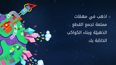
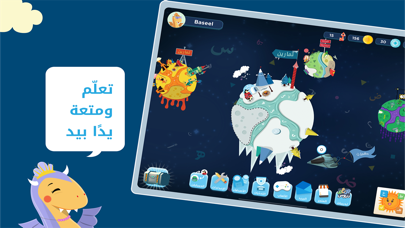
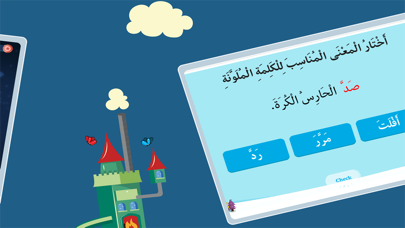
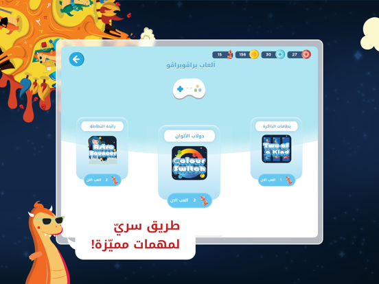
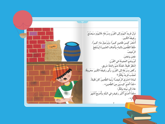
براڤوبراڤو هو تطبيق ممتع للطّلّاب وأداة تقييم شاملة للمعلّمين وأولياء الأمور، صمّمه مجموعة من التّربويّين من أجل التّربويّين في ميدان التّعليم، لبناء بيئة تعاونيّة قويّة بين المتعلّمين من الصّفوف 1-4، لتحفيز تعلُّمهم والتّحسين المستمرّ لأدائهم الأكاديميّ. يمنح براڤوبراڤو المتعلّمين تجربة تفاعليّة مطبّقة من خلال عناصر الألعاب المصمّمة بشكل جميل لتعزيز فضولهم، ومحاكاة خيالهم، والمحافظة على انخراطهم، مع تطوّر تدريجيّ من خلال المكافآت والتّرقيات. أمّا للمعلّمين، فإنّ براڤوبراڤو يوفِّر وقتهم من خلال أدوات التّقييم وإعداد التّقارير الفعّالة، ويمهِّد الطّريق للتّباين في التّعلّم، وبذلك يمكِّن المعلّمين من تحديد نقاط الضّعف لدى طلابهم ومعالجتها وتعزيز نقاط قوّتهم. أمّا أولياء الأمورفإنّ براڤوبراڤو يتيح الفرصة لتفاعلهم ومشاركتهم في الأداء الأكاديميّ لأطفالهم؛ لتشجيع تطوّرهم ورفع مستوى تجربة التّعلّم لديهم. الميزات الرّئيسة * مُصمًّم للمتعلّمين من الصّفوف 1-4. * موضوعه واحد: اللُّغة العربيّة …
App details
What you can learn from BravoBravo
Every shipping app on the App Store has gone through the same decisions you're working through right now: which screenshot goes first, what caption sits over it, which device frame to show, what color the background should be. The 19 screenshots above are BravoBravo's answers to those questions — they're public, they're real, and they made it through Apple's review.
What the numbers say: BravoBravo runs a mixed light-and-dark set where the background shifts from screenshot to screenshot (first shot #041424) — each image has to stand on its own, so the captions carry more of the story. The accent colour we picked up, #1CDC7C, is the one to reuse for badges, arrows and highlighted words if you borrow this look. Hit Use this style to open the editor with these exact colours and drop your own screenshot in.
Notice the first screenshot in particular. It's the one users see in search results and on the product page, and it's where most apps spend their best caption and tightest design. Look at the proportion of background to phone, where the text sits, what one thing the image is trying to communicate.
Want to see how other Education apps approach the same problem? Browse more Education apps in the showcase.
Take what works into your own screenshots
Open LaunchShots and design your App Store & Google Play screenshots — pick a device frame, drop captions, ship in minutes. Free, in your browser.
Open the screenshot editor →Apps with a similar look
Closest background + accent colours among the listings we've analysed — useful when you want to see the same palette handled by a different team.