Chart position — tracked daily by LaunchShots
Screenshot style breakdown
Sampled from 5 of VietPN's App Store screenshots — background, accent and theme, measured by LaunchShots (not something Apple publishes).
#FCFCF4 bg
#DDDDD6
#4484DC accent
#111111 text
Reading the caption text from the screenshots in your browser…
Screenshots

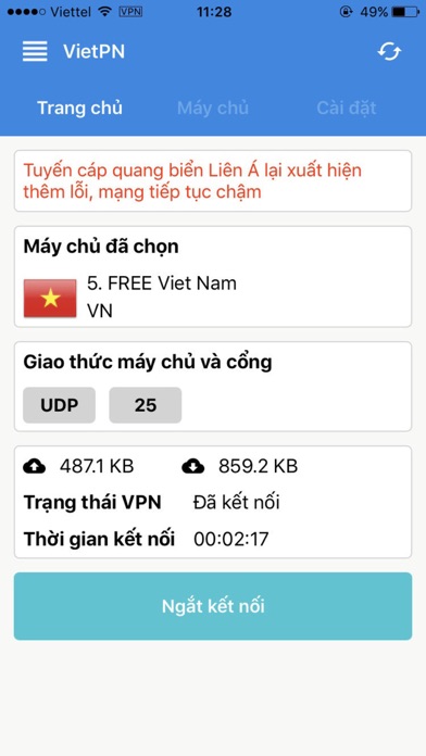

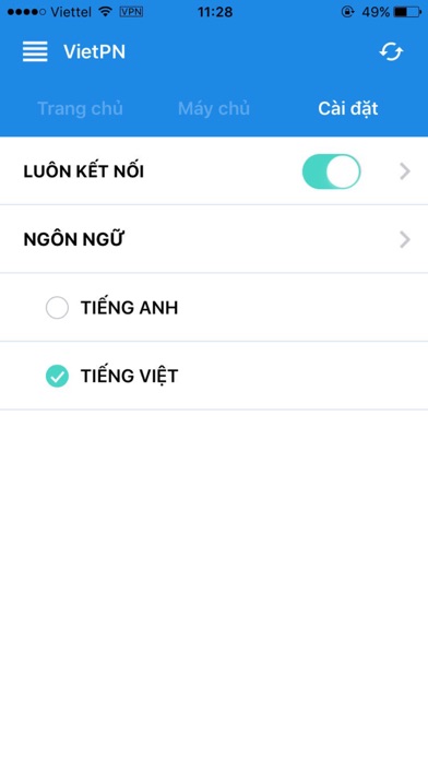

iPad screenshots


Icon palette
About this app
VietPN — Kết nối an toàn, cải thiện tốc độ mạng VietPN là dịch vụ VPN giúp bảo vệ dữ liệu của bạn và tối ưu cho mạng có kết nối quốc tế kém. Mã hoá kết nối, ẩn địa chỉ IP và giữ an toàn thông tin khi bạn sử dụng mạng — đặc biệt trên WiFi công cộng. BẢO MẬT & RIÊNG TƯ - Mã hoá kết nối 256-bit, bảo vệ dữ liệu trên đường truyền. - Ẩn địa chỉ IP, tăng tính riêng tư khi online. - An toàn hơn khi dùng WiFi công cộng: quán cà phê, sân bay, khách sạn. - Bảo vệ thông tin nhạy cảm như mật khẩu khi kết nối mạng. - Chúng tôi không bán và không chia sẻ dữ liệu của bạn cho bên thứ ba. MÁY CHỦ NHIỀU QUỐC GIA - Hệ thống máy chủ tại Việt Nam, Singapore, Hong Kong, Nhật Bản, Hoa Kỳ và nhiều nơi khác. - Liên tục mở rộng — chọn máy chủ phù hợp để có tốc độ và ping tốt nhất. ĐƠN GIẢN, NHANH GỌN - Kết nối chỉ với một chạm. - Hiển thị tốc độ tải lên/tải xuống theo thời gian thực. - Giao diện gọn nhẹ, dễ d…
App details
What you can learn from VietPN
Every shipping app on the App Store has gone through the same decisions you're working through right now: which screenshot goes first, what caption sits over it, which device frame to show, what color the background should be. The 10 screenshots above are VietPN's answers to those questions — they're public, they're real, and they made it through Apple's review.
What the numbers say: VietPN runs a light set with one background colour (#FCFCF4) carried across every screenshot — the listing reads as a single poster when the shots sit side by side in search results. The accent colour we picked up, #4484DC, is the one to reuse for badges, arrows and highlighted words if you borrow this look. Hit Use this style to open the editor with these exact colours and drop your own screenshot in.
Notice the first screenshot in particular. It's the one users see in search results and on the product page, and it's where most apps spend their best caption and tightest design. Look at the proportion of background to phone, where the text sits, what one thing the image is trying to communicate.
Want to see how other Utilities apps approach the same problem? Browse more Utilities apps in the showcase.
Take what works into your own screenshots
Open LaunchShots and design your App Store & Google Play screenshots — pick a device frame, drop captions, ship in minutes. Free, in your browser.
Open the screenshot editor →Apps with a similar look
Closest background + accent colours among the listings we've analysed — useful when you want to see the same palette handled by a different team.