Chart position — tracked daily by LaunchShots
Screenshot style breakdown
Sampled from 6 of 挨饿荒野's App Store screenshots — background, accent and theme, measured by LaunchShots (not something Apple publishes).
#0C0C0C bg
#2E2E2E
#3C6C6C accent
#FFFFFF text
Screenshots


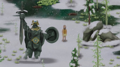
iPad screenshots
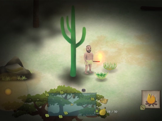
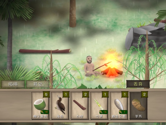


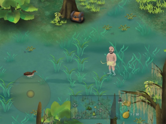

Icon palette
About this app
在游戏中,玩家扮演求生专家埃德在世界上各种残酷的环境中挑战生存。包括泰国森林,菲律宾海岛,非洲平原等。身上没有携带任何工具,没有衣服,没有食物,没有水,甚至没有一把刀。但是即便这样,顽强的埃德还是能战胜恶劣的环境,照样过上舒适的生活。 【游戏特色】 开放式沙盒求生模拟游戏 每个场景的地域都非常广阔,你可以在任何地点搭建营地,点燃篝火。也可以将陷阱放置在任何你觉得可以捕捉的到猎物的地方。下雨天时,你可以用容器接水,夜晚伸手不见五指的时候,你可以点燃火把进行照明。 寻找游戏中的隐藏任务 每个场景都带有两个隐藏任务,需要自己去发现或在特定的条件下触发,每个场景的主线任务和隐藏任务完成后会有特殊的奖励。 捕猎是个技术活 游戏中有不少投掷类工具,石头,竹叉,弓箭。有时候你会碰到一些猎物,如草原上的兔子,池塘里的鱼。你需要用你的投掷工具瞄准猎物进行猎杀,当然不同的猎物需要不同的投掷工具。 遇到大型危险动物怎么办 当生存几天后,偶尔会碰到一些大型危险动物,如:森林里的狼,非洲平原上的鬣狗,沼泽里的鳄鱼等。…
App details
What you can learn from 挨饿荒野
Every shipping app on the App Store has gone through the same decisions you're working through right now: which screenshot goes first, what caption sits over it, which device frame to show, what color the background should be. The 16 screenshots above are 挨饿荒野's answers to those questions — they're public, they're real, and they made it through Apple's review.
What the numbers say: 挨饿荒野 runs a mixed light-and-dark set where the background shifts from screenshot to screenshot (first shot #0C0C0C) — each image has to stand on its own, so the captions carry more of the story. The accent colour we picked up, #3C6C6C, is the one to reuse for badges, arrows and highlighted words if you borrow this look. Hit Use this style to open the editor with these exact colours and drop your own screenshot in.
Notice the first screenshot in particular. It's the one users see in search results and on the product page, and it's where most apps spend their best caption and tightest design. Look at the proportion of background to phone, where the text sits, what one thing the image is trying to communicate.
Want to see how other Games apps approach the same problem? Browse more Games apps in the showcase.
Take what works into your own screenshots
Open LaunchShots and design your App Store & Google Play screenshots — pick a device frame, drop captions, ship in minutes. Free, in your browser.
Open the screenshot editor →Apps with a similar look
Closest background + accent colours among the listings we've analysed — useful when you want to see the same palette handled by a different team.