Chart position — tracked daily by LaunchShots
Screenshot style breakdown
Sampled from 5 of diction's App Store screenshots — background, accent and theme, measured by LaunchShots (not something Apple publishes).
#FCFCFC bg
#DDDDDD
#FCD404 accent
#111111 text
Screenshots


Icon palette
About this app
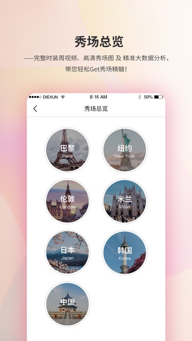
蝶讯DICTION APP,是蝶讯网为时尚业者度身打造的专业移动应用。 DICTION APP不仅可以帮助服饰设计师、买手等时尚业者预判流行趋势,还能为其提供丰富的潮流款式和最新的设计素材参考,使其工作效率大大提升。 DICTION APP 还内置大咖移动课堂、网红明星最IN穿搭,并搭载AI功能模块,随时随地为业界人士的职业成长和发展赋能。 DICTON APP囊括:时尚头条、趋势资讯、蝶讯学院、时尚博主、色彩实验室等多个板块内容。
App details
What you can learn from diction
Every shipping app on the App Store has gone through the same decisions you're working through right now: which screenshot goes first, what caption sits over it, which device frame to show, what color the background should be. The 5 screenshots above are diction's answers to those questions — they're public, they're real, and they made it through Apple's review.
What the numbers say: diction runs a light set where the background shifts from screenshot to screenshot (first shot #FCFCFC) — each image has to stand on its own, so the captions carry more of the story. The accent colour we picked up, #FCD404, is the one to reuse for badges, arrows and highlighted words if you borrow this look. Hit Use this style to open the editor with these exact colours and drop your own screenshot in.
Notice the first screenshot in particular. It's the one users see in search results and on the product page, and it's where most apps spend their best caption and tightest design. Look at the proportion of background to phone, where the text sits, what one thing the image is trying to communicate.
Want to see how other News apps approach the same problem? Browse more News apps in the showcase.
Take what works into your own screenshots
Open LaunchShots and design your App Store & Google Play screenshots — pick a device frame, drop captions, ship in minutes. Free, in your browser.
Open the screenshot editor →Apps with a similar look
Closest background + accent colours among the listings we've analysed — useful when you want to see the same palette handled by a different team.