Chart position — tracked daily by LaunchShots
Screenshot style breakdown
Sampled from 6 of Đếm Ngược Ngày Thi - THPTQG's App Store screenshots — background, accent and theme, measured by LaunchShots (not something Apple publishes).
#1C2C3C bg
#3B4957
#9CE4F4 accent
#FFFFFF text
Screenshots


iPad screenshots


Icon palette
About this app
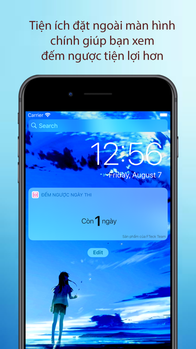
Để hỗ trợ các học sinh lớp 12 đang ôn thi vào đại học, chúng mình xin được giới thiệu ứng dụng "Đếm ngược ngày thi” dành cho iOS. Chức năng chính của ứng dụng này là đếm ngược thời gian cho đến ngày thi quan trọng nhất trong 12 năm cắp sách đến trường ”KÌ THI TỐT NGHIỆP TRUNG HỌC PHỔ THÔNG” Nhưng không đơn thuần là đếm ngày, bọn mình còn bổ sung cho nó những tính năng sau đây + Kho tài liệu học tập, đề thi phong phú và luôn được cập nhật liên tục gồm đủ các môn Toán, Lý, Hóa, Sinh,... + Chức năng ghi chú giúp ghi lại kế hoạch cũng như các việc cần làm trong tương lai để tránh bị quên, phục vụ cho việc học tập như ghi lại lịch đi học thêm này, ghi chú học hành... + Tiện ích hiện số ngày còn lại ở bảng thông báo của iOS + Bạn sẽ nhận được thông báo cập nhật từ các AD khi có tài liệu mới, thông tin mới về kì thi, những lời chúc, hay nhắc nhở ngày thi hằng ngày, ..v.v... + Giao diện đơn g…
App details
What you can learn from Đếm Ngược Ngày Thi - THPTQG
Every shipping app on the App Store has gone through the same decisions you're working through right now: which screenshot goes first, what caption sits over it, which device frame to show, what color the background should be. The 12 screenshots above are Đếm Ngược Ngày Thi - THPTQG's answers to those questions — they're public, they're real, and they made it through Apple's review.
What the numbers say: Đếm Ngược Ngày Thi - THPTQG runs a mixed light-and-dark set where the background shifts from screenshot to screenshot (first shot #1C2C3C) — each image has to stand on its own, so the captions carry more of the story. The accent colour we picked up, #9CE4F4, is the one to reuse for badges, arrows and highlighted words if you borrow this look. Hit Use this style to open the editor with these exact colours and drop your own screenshot in.
Notice the first screenshot in particular. It's the one users see in search results and on the product page, and it's where most apps spend their best caption and tightest design. Look at the proportion of background to phone, where the text sits, what one thing the image is trying to communicate.
Want to see how other Education apps approach the same problem? Browse more Education apps in the showcase.
Take what works into your own screenshots
Open LaunchShots and design your App Store & Google Play screenshots — pick a device frame, drop captions, ship in minutes. Free, in your browser.
Open the screenshot editor →Apps with a similar look
Closest background + accent colours among the listings we've analysed — useful when you want to see the same palette handled by a different team.