Chart position — tracked daily by LaunchShots
Screenshot style breakdown
Sampled from 6 of Veðrið - Veður á Íslandi's App Store screenshots — background, accent and theme, measured by LaunchShots (not something Apple publishes).
#0C64D4 bg
#2E79DA
#143464 accent
#FFFFFF text
Reading the caption text from the screenshots in your browser…
Screenshots





iPad screenshots



Icon palette
About this app
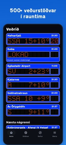
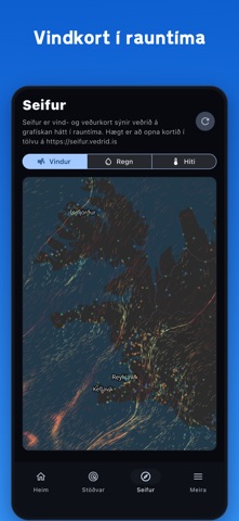
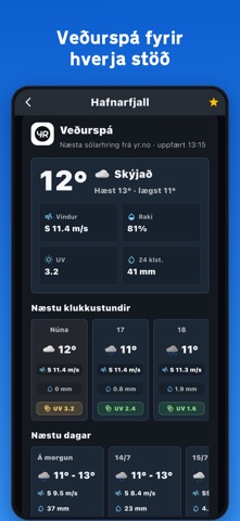
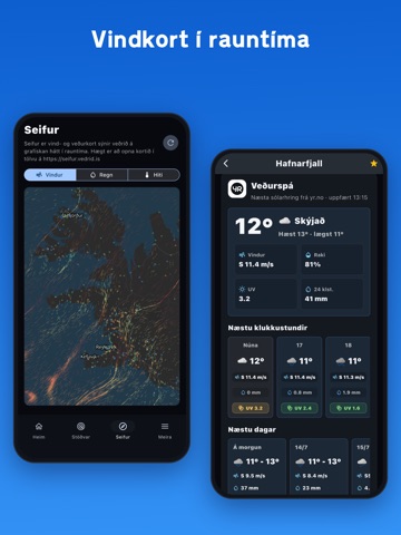
Veðrið sýnir veðurupplýsingar frá íslenskum veðurstöðvum í einföldu og læsilegu viðmóti, byggðu á kunnuglegum veðurskiltum Vegagerðarinnar. Sýnir raunmælingar fyrir vind, vindhviður, hita og viðvaranir frá veðurstöðvum um allt land. Auk þess er veðurspá fyrir allar veðurstöðvar frá YR. Gögnin koma frá Vegagerðinni, Veðurstofu Íslands, YR, MET.no og Ambientweather-stöðvum einstaklinga á Íslandi. Veðrið er hugsað fyrir fólk á ferð um Ísland sem vill sjá skýrar upplýsingar fljótt um veður. Helstu eiginleikar: - Veðurskilti í símanum, byggð á lifandi mælingum. - Um 500 veðurstöðvar á Íslandi. - Stöðvar nærri þér þegar þú ert á ferðalagi. - Kort með vindi og hita í rauntíma. - Veðurspá frá YR - Viðvaranir og upplýsingar um færð á nærliggjandi vegum þegar gögn eru til staðar. - Raðaðu veðurstöðvunum þínum eins og þú vilt. - Gögn frá Vegagerðinni, Veðurstofu Íslands, YR, MET.no og Ambient Weat…
App details
What you can learn from Veðrið - Veður á Íslandi
Every shipping app on the App Store has gone through the same decisions you're working through right now: which screenshot goes first, what caption sits over it, which device frame to show, what color the background should be. The 14 screenshots above are Veðrið - Veður á Íslandi's answers to those questions — they're public, they're real, and they made it through Apple's review.
What the numbers say: Veðrið - Veður á Íslandi runs a dark set where the background shifts from screenshot to screenshot (first shot #0C64D4) — each image has to stand on its own, so the captions carry more of the story. The accent colour we picked up, #143464, is the one to reuse for badges, arrows and highlighted words if you borrow this look. Hit Use this style to open the editor with these exact colours and drop your own screenshot in.
Notice the first screenshot in particular. It's the one users see in search results and on the product page, and it's where most apps spend their best caption and tightest design. Look at the proportion of background to phone, where the text sits, what one thing the image is trying to communicate.
Want to see how other Weather apps approach the same problem? Browse more Weather apps in the showcase.
Take what works into your own screenshots
Open LaunchShots and design your App Store & Google Play screenshots — pick a device frame, drop captions, ship in minutes. Free, in your browser.
Open the screenshot editor →Apps with a similar look
Closest background + accent colours among the listings we've analysed — useful when you want to see the same palette handled by a different team.