Chart position — tracked daily by LaunchShots
Screenshot style breakdown
Sampled from 6 of コンビニシール倶楽部's App Store screenshots — background, accent and theme, measured by LaunchShots (not something Apple publishes).
#FCFCEC bg
#DDDDCF
#EC9C8C accent
#111111 text
Screenshots



Icon palette
About this app
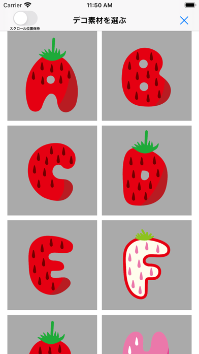
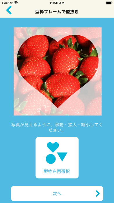
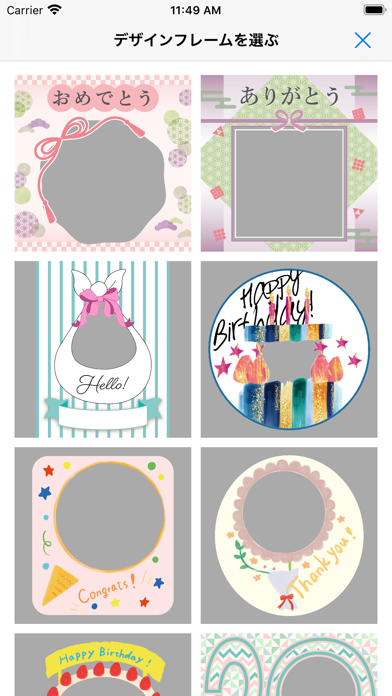
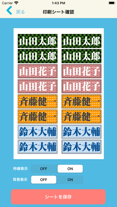
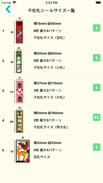
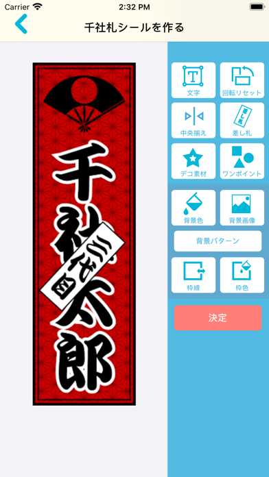
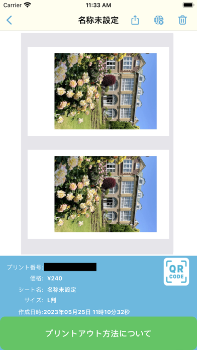
『コンビニシール倶楽部』は、写真を取り込んでオリジナルなシールシートやステッカーを作成できるスマホアプリです。画像の領域切り取り、装飾フレームやデコ画像による合成、書体を選んで文字入れ、などを行うことができる “シールDIYアプリ”です。 目的に応じて、①シール素材を作って配置する「シール」②持ち物の名付けに便利な「お名前シール」③スクエア形状の「ステッカー」④4カットフォトシール/インスタントフォトシール/千社札/おまけシール・マグネットチラシ用シール・トレーディングカードサイズシールの「バラエティ」など様々なシールが作成可能です。作成済みの素材やシートを保管するキャビネットが提供され、シール作品の公開機能やSNS連携の機能も提供されます。 作成したシールコンテンツにはコンビニプリントのためのプリント番号やQRコードが発行されるとともにキャビネット保管やコンテンツ公開機能が搭載されます。コンビニでのプリント料金は シール紙L判240円 シール紙2L判400円 シール紙スクエア(ましかく)判320円となります。 …
App details
What you can learn from コンビニシール倶楽部
Every shipping app on the App Store has gone through the same decisions you're working through right now: which screenshot goes first, what caption sits over it, which device frame to show, what color the background should be. The 10 screenshots above are コンビニシール倶楽部's answers to those questions — they're public, they're real, and they made it through Apple's review.
What the numbers say: コンビニシール倶楽部 runs a light set where the background shifts from screenshot to screenshot (first shot #FCFCEC) — each image has to stand on its own, so the captions carry more of the story. The accent colour we picked up, #EC9C8C, is the one to reuse for badges, arrows and highlighted words if you borrow this look. Hit Use this style to open the editor with these exact colours and drop your own screenshot in.
Notice the first screenshot in particular. It's the one users see in search results and on the product page, and it's where most apps spend their best caption and tightest design. Look at the proportion of background to phone, where the text sits, what one thing the image is trying to communicate.
Want to see how other Photo & Video apps approach the same problem? Browse more Photo & Video apps in the showcase.
Take what works into your own screenshots
Open LaunchShots and design your App Store & Google Play screenshots — pick a device frame, drop captions, ship in minutes. Free, in your browser.
Open the screenshot editor →Apps with a similar look
Closest background + accent colours among the listings we've analysed — useful when you want to see the same palette handled by a different team.