Screenshot changes — detected by LaunchShots
Screenshot style breakdown
Sampled from 6 of DuoCards: Изучение языков's App Store screenshots — background, accent and theme, measured by LaunchShots (not something Apple publishes).
#4CA4E4 bg
#4290C8
#4C748C accent
#111111 text
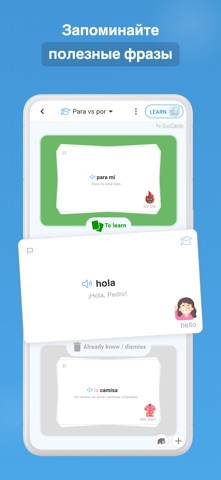
- #1Слова которые запомнятся < ‚©
- #2Практика с ИИ-репетитором
- #3Говорите в реальных ситуациях <; ORDERING ATAXI &
- #4Учитесь по видео и статьям QQ ЕЕ SPANISH + =
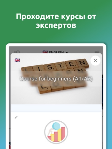
- #5Проходите
- #6Сохраняйте слова из видео
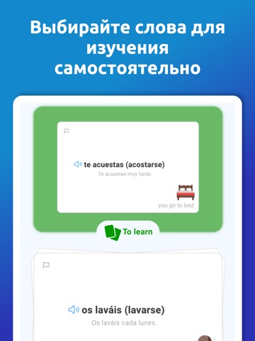
Captions read from the screenshots (OCR, may contain small errors): 6 headlines, 5.2 words on average (longest 10).
Screenshots




iPad screenshots




Icon palette
About this app
Учите слова из реальных видео, статей и фраз, которые вам действительно нужны. DuoCards помогает сохранять новую лексику, тренировать произношение и повторять слова с помощью умных карточек и интервального повторения. В DuoCards можно: - Сохранять слова и выражения из видео, субтитров и статей - Практиковать реальные диалоги с ИИ-репетитором - Улучшать произношение с обратной связью - Повторять лексику с карточками по вашему прогрессу - Учить английский, испанский, французский, немецкий, японский и 50+ языков - Использовать готовые курсы, открытые наборы или свои списки слов Находите слово в контексте, добавляйте его в личный набор, тренируйтесь и повторяйте в нужный момент. Для учебы, работы, путешествий и общения DuoCards помогает постепенно расширять словарный запас. Скачайте DuoCards и начните учить слова с контекстом. Terms of use: https://www.duocards.com/termsofuse.html Pri…
App details
What you can learn from DuoCards: Изучение языков
Every shipping app on the App Store has gone through the same decisions you're working through right now: which screenshot goes first, what caption sits over it, which device frame to show, what color the background should be. The 18 screenshots above are DuoCards: Изучение языков's answers to those questions — they're public, they're real, and they made it through Apple's review.
What the numbers say: DuoCards: Изучение языков runs a light set where the background shifts from screenshot to screenshot (first shot #4CA4E4) — each image has to stand on its own, so the captions carry more of the story. The accent colour we picked up, #4C748C, is the one to reuse for badges, arrows and highlighted words if you borrow this look. Hit Use this style to open the editor with these exact colours and drop your own screenshot in.
Notice the first screenshot in particular. It's the one users see in search results and on the product page, and it's where most apps spend their best caption and tightest design. Look at the proportion of background to phone, where the text sits, what one thing the image is trying to communicate.
Want to see how other Education apps approach the same problem? Browse more Education apps in the showcase.
Take what works into your own screenshots
Open LaunchShots and design your App Store & Google Play screenshots — pick a device frame, drop captions, ship in minutes. Free, in your browser.
Open the screenshot editor →Apps with a similar look
Closest background + accent colours among the listings we've analysed — useful when you want to see the same palette handled by a different team.