Chart position — tracked daily by LaunchShots
Screenshot changes — detected by LaunchShots
Screenshot style breakdown
Sampled from 6 of التقويم الهجري والميلادي's App Store screenshots — background, accent and theme, measured by LaunchShots (not something Apple publishes).
#041C14 bg
#273B34
#547444 accent
#FFFFFF text
Screenshots

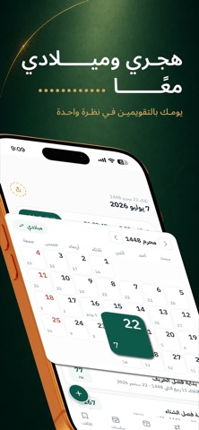


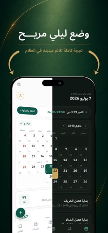
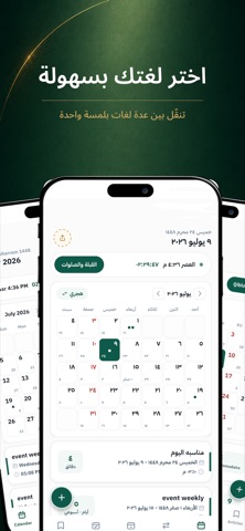
iPad screenshots


Icon palette
About this app
اعرف تاريخ اليوم بالهجري والميلادي، وتابع مواقيت الصلاة واتجاه القبلة، ونظّم مناسباتك وتذكيراتك في تطبيق واحد. التقويم وتحويل التاريخ • عرض التاريخ الهجري والميلادي معًا، مع تصفح الأشهر والسنوات. • تحويل التاريخ من هجري إلى ميلادي وبالعكس. • مشاركة التاريخ بسهولة. الصلاة والقبلة • مواقيت الصلاة حسب موقعك، مع تنبيهات قابلة للتخصيص. • تحديد اتجاه القبلة. • إمساكية رمضان لمتابعة مواقيت الشهر. المناسبات والتذكيرات • عرض المناسبات العامة والأعياد والمدة المتبقية لها. • إضافة مناسباتك الخاصة واختيار تذكيراتها. ودجات للشاشة الرئيسية تابع تاريخ اليوم ومواقيت الصلاة ومناسباتك دون الحاجة إلى فتح التطبيق في كل مرة. تجربة تناسبك • وضع ليلي وواجهة تناسب iPhone وiPad. • العربية والإنجليزية والفرنسية. • الاختيار بين الأرقام العربية والهندية. • قراءة المقالات وحفظها للرجوع إليها. إزالة الإعلانات المزايا الأساسية متاحة مجانًا مع الإعلانات. لإزالة الإعلانات، يمكنك اختيار اشتراك شهري أو سنوي يتجدد ت…
App details
What you can learn from التقويم الهجري والميلادي
Every shipping app on the App Store has gone through the same decisions you're working through right now: which screenshot goes first, what caption sits over it, which device frame to show, what color the background should be. The 16 screenshots above are التقويم الهجري والميلادي's answers to those questions — they're public, they're real, and they made it through Apple's review.
What the numbers say: التقويم الهجري والميلادي runs a dark set with one background colour (#041C14) carried across every screenshot — the listing reads as a single poster when the shots sit side by side in search results. The accent colour we picked up, #547444, is the one to reuse for badges, arrows and highlighted words if you borrow this look. Hit Use this style to open the editor with these exact colours and drop your own screenshot in.
Notice the first screenshot in particular. It's the one users see in search results and on the product page, and it's where most apps spend their best caption and tightest design. Look at the proportion of background to phone, where the text sits, what one thing the image is trying to communicate.
Want to see how other Productivity apps approach the same problem? Browse more Productivity apps in the showcase.
Take what works into your own screenshots
Open LaunchShots and design your App Store & Google Play screenshots — pick a device frame, drop captions, ship in minutes. Free, in your browser.
Open the screenshot editor →Apps with a similar look
Closest background + accent colours among the listings we've analysed — useful when you want to see the same palette handled by a different team.