Chart position — tracked daily by LaunchShots
Screenshot changes — detected by LaunchShots
Screenshot style breakdown
Sampled from 6 of Rhythm: metronome tempo tutor's App Store screenshots — background, accent and theme, measured by LaunchShots (not something Apple publishes).
#E4E49C bg
#C8C889
#248CC4 accent
#111111 text
Reading the caption text from the screenshots in your browser…
Screenshots




iPad screenshots




Icon palette
About this app
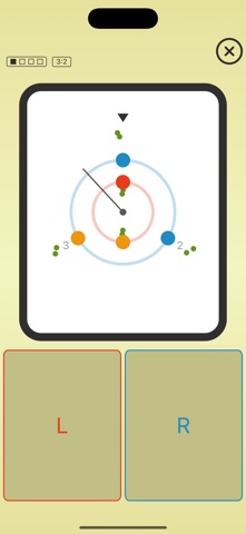
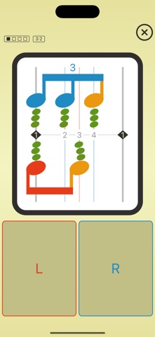
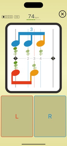
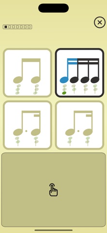
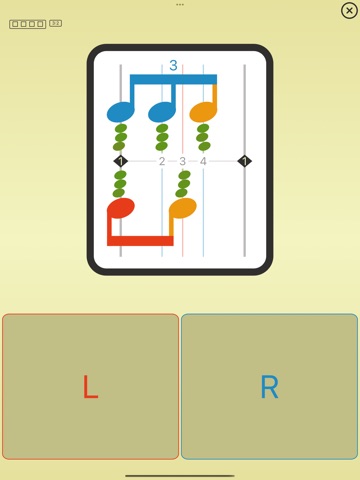
Want to develop a sense of rhythm? Do you want to accurately perform complex rhythmic patterns? NEW — POLYRHYTHM MODE Two hands, two counts inside one beat. 3 against 2 is open here, the one every musician meets first — and it is the whole mode, not a taste of it: four stages, from one hand alone up to both at speed, each one scored. - Two tap zones, one for each hand. Every hand is scored on its own, so you can see which one is drifting and by how much. - Read the cycle as notation or as two turning rings — the same exercise, whichever way makes it click for you. - Give each hand its own instrument, so the two lines stay apart by ear. - Practice runs the cycle over and over and lets the tempo follow your hands: up a step when the cycle comes out clean, back down when it doesn't. Sessions here run five minutes. - Polyrhythm accuracy is kept apart from your rhythm statistics: it train…
App details
What you can learn from Rhythm: metronome tempo tutor
Every shipping app on the App Store has gone through the same decisions you're working through right now: which screenshot goes first, what caption sits over it, which device frame to show, what color the background should be. The 16 screenshots above are Rhythm: metronome tempo tutor's answers to those questions — they're public, they're real, and they made it through Apple's review.
What the numbers say: Rhythm: metronome tempo tutor runs a light set where the background shifts from screenshot to screenshot (first shot #E4E49C) — each image has to stand on its own, so the captions carry more of the story. The accent colour we picked up, #248CC4, is the one to reuse for badges, arrows and highlighted words if you borrow this look. Hit Use this style to open the editor with these exact colours and drop your own screenshot in.
Notice the first screenshot in particular. It's the one users see in search results and on the product page, and it's where most apps spend their best caption and tightest design. Look at the proportion of background to phone, where the text sits, what one thing the image is trying to communicate.
Want to see how other Music apps approach the same problem? Browse more Music apps in the showcase.
Take what works into your own screenshots
Open LaunchShots and design your App Store & Google Play screenshots — pick a device frame, drop captions, ship in minutes. Free, in your browser.
Open the screenshot editor →Apps with a similar look
Closest background + accent colours among the listings we've analysed — useful when you want to see the same palette handled by a different team.