Chart position — tracked daily by LaunchShots
Screenshot style breakdown
Sampled from 5 of なろうブック's App Store screenshots — background, accent and theme, measured by LaunchShots (not something Apple publishes).
#049CAC bg
#27A9B7
#7CCCD4 accent
#FFFFFF text
Screenshots


iPad screenshots



Icon palette
About this app
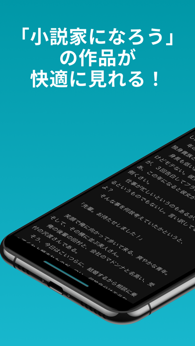
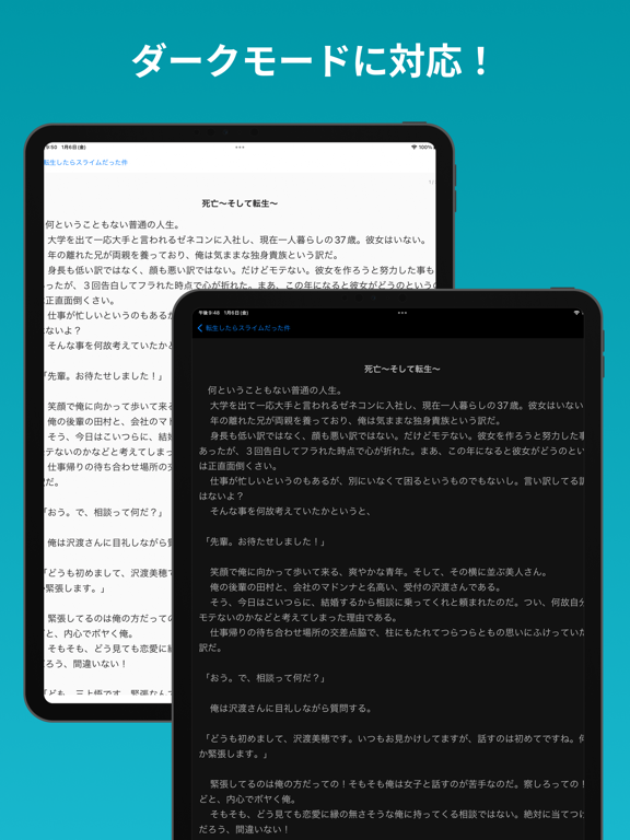
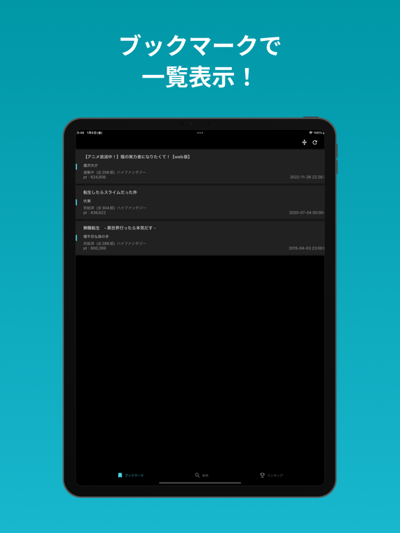
なろうブックは、「小説家になろう」に掲載されている小説を検索・ブックマークし、読みかけの続きからすぐに読めるiPhone・iPad向けの小説リーダーアプリです。 ランキングやジャンル検索で読みたい作品を見つけ、文字サイズ・行間・背景色を好みに合わせて、スワイプで次の話へ読み進められます。 ※本アプリは「小説家になろう」の公式アプリではありません。 ■なろうブックでできること ・キーワード・ジャンル・小説タイプで作品を検索 ・日間/週間/月間/四半期ランキングをジャンル別に表示 ・ブックマークした作品の既読管理と「続きから読む」 ・読みかけの話を、最後に読んでいた位置から再開 ・閲覧履歴から、最近読んだ作品にすぐ戻る ・文字サイズ・行間・背景色(7種類)の調整、ダークモード対応 ・スワイプで前後の話へページ送り ■作品を探す(検索) タイトル・作者名・あらすじからキーワードで検索できます。作品ページのURLを入力して直接開くこともできます。 ・除外ワード:指定した語を含む作品を検索結果から外せます ・小説タイプ:短編…
App details
What you can learn from なろうブック
Every shipping app on the App Store has gone through the same decisions you're working through right now: which screenshot goes first, what caption sits over it, which device frame to show, what color the background should be. The 10 screenshots above are なろうブック's answers to those questions — they're public, they're real, and they made it through Apple's review.
What the numbers say: なろうブック runs a mixed light-and-dark set where the background shifts from screenshot to screenshot (first shot #049CAC) — each image has to stand on its own, so the captions carry more of the story. The accent colour we picked up, #7CCCD4, is the one to reuse for badges, arrows and highlighted words if you borrow this look. Hit Use this style to open the editor with these exact colours and drop your own screenshot in.
Notice the first screenshot in particular. It's the one users see in search results and on the product page, and it's where most apps spend their best caption and tightest design. Look at the proportion of background to phone, where the text sits, what one thing the image is trying to communicate.
Want to see how other Book apps approach the same problem? Browse more Book apps in the showcase.
Take what works into your own screenshots
Open LaunchShots and design your App Store & Google Play screenshots — pick a device frame, drop captions, ship in minutes. Free, in your browser.
Open the screenshot editor →Apps with a similar look
Closest background + accent colours among the listings we've analysed — useful when you want to see the same palette handled by a different team.