Chart position — tracked daily by LaunchShots
Screenshot style breakdown
Sampled from 4 of Oxford - развитие мозга's App Store screenshots — background, accent and theme, measured by LaunchShots (not something Apple publishes).
#044464 bg
#275E79
#648CA4 accent
#FFFFFF text
Screenshots
iPad screenshots

Icon palette
About this app
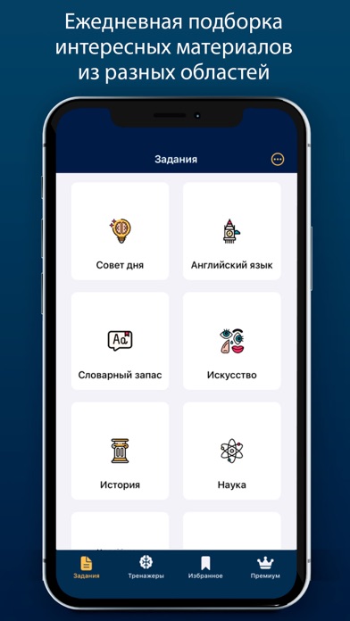
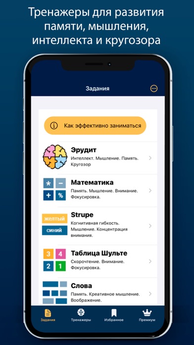
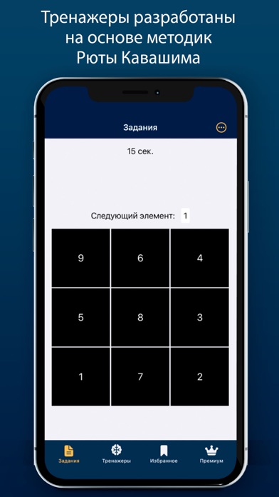
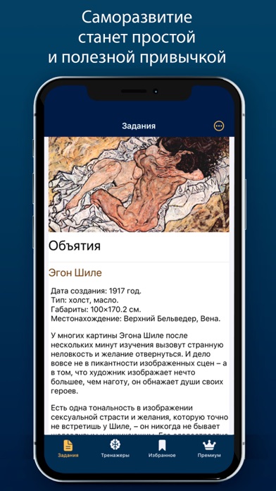
Хотите стать умнее, эффективнее, развить мозг, улучшить память, повысить IQ, расширить кругозор, концентрацию внимания и мышление? интересуетесь саморазвитием? Тогда это развивающее интеллект приложение для Вас! Ведь знания - сила. Oxford - это ваш личный университет в смартфоне. Вы выбираете интересные вам предметы, мы подбираем интересные, современные материалы. Если хотите острый интеллект, здоровую память, умные мозги в старости - учитесь, знания - это сила! Учиться нужно всю жизнь - это научно доказанный факт. Приложение тренировки мозга - это простой способ развивать мозг и память каждый день, требующий от вас всего лишь открыть приложение и уделить ему 5 минут во время утреннего кофе или по пути на работу. Образование - это ваше будущее. Наше приложение развития памяти и ума состоит из 2-х разделов: Задания для саморазвития Это ежедневные познавательные статьи из разных обла…
App details
What you can learn from Oxford - развитие мозга
Every shipping app on the App Store has gone through the same decisions you're working through right now: which screenshot goes first, what caption sits over it, which device frame to show, what color the background should be. The 6 screenshots above are Oxford - развитие мозга's answers to those questions — they're public, they're real, and they made it through Apple's review.
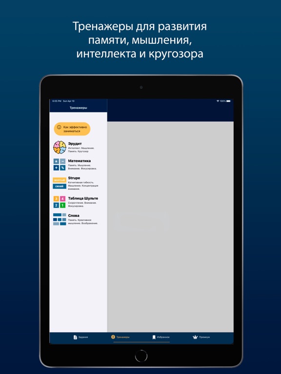
What the numbers say: Oxford - развитие мозга runs a dark set with one background colour (#044464) carried across every screenshot — the listing reads as a single poster when the shots sit side by side in search results. The accent colour we picked up, #648CA4, is the one to reuse for badges, arrows and highlighted words if you borrow this look. Hit Use this style to open the editor with these exact colours and drop your own screenshot in.
Notice the first screenshot in particular. It's the one users see in search results and on the product page, and it's where most apps spend their best caption and tightest design. Look at the proportion of background to phone, where the text sits, what one thing the image is trying to communicate.
Want to see how other Education apps approach the same problem? Browse more Education apps in the showcase.
Take what works into your own screenshots
Open LaunchShots and design your App Store & Google Play screenshots — pick a device frame, drop captions, ship in minutes. Free, in your browser.
Open the screenshot editor →Apps with a similar look
Closest background + accent colours among the listings we've analysed — useful when you want to see the same palette handled by a different team.