Chart position — tracked daily by LaunchShots
Screenshot changes — detected by LaunchShots
Screenshot style breakdown
Sampled from 6 of InkStory: Манга и новеллы's App Store screenshots — background, accent and theme, measured by LaunchShots (not something Apple publishes).
#040404 bg
#272727
#048CF4 accent
#FFFFFF text
Reading the caption text from the screenshots in your browser…
Screenshots
iPad screenshots


Icon palette
About this app
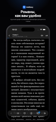
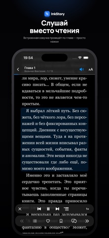
InkStory — манга и новеллы от русских авторов и художников в одном приложении. Находите новые истории, собирайте личную библиотеку и возвращайтесь к любимым книгам с того места, где остановились. Открывайте новинки, популярные произведения и лучшие завершённые истории. Ищите книги по названию, жанрам, рейтингу и другим параметрам, изучайте отзывы и подборки читателей. Читайте так, как удобно вам. Настраивайте режим чтения, направление страниц и оформление. Для новелл выбирайте шрифт, размер текста, межстрочный интервал и поля. Используйте закладки и историю чтения, чтобы легко продолжать начатое. Слушайте новеллы, когда удобнее слушать, чем читать. Встроенная озвучка читает текст вслух: выбирайте голос, регулируйте скорость и запускайте воспроизведение с нужного абзаца. Подсветка читаемого текста и автоматическая прокрутка помогают следить за историей. С подпиской Deluxe озвучка сам…
App details
What you can learn from InkStory: Манга и новеллы
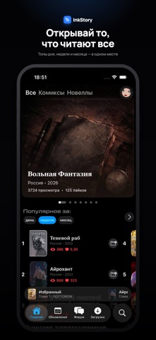
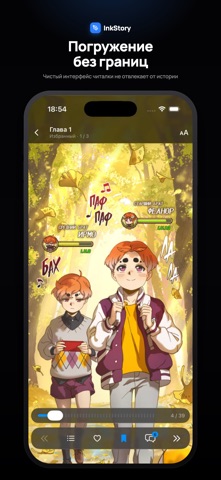
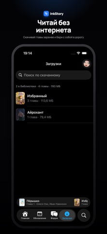
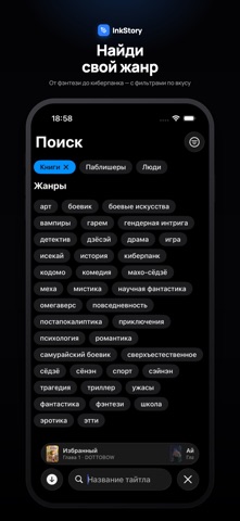
Every shipping app on the App Store has gone through the same decisions you're working through right now: which screenshot goes first, what caption sits over it, which device frame to show, what color the background should be. The 11 screenshots above are InkStory: Манга и новеллы's answers to those questions — they're public, they're real, and they made it through Apple's review.
What the numbers say: InkStory: Манга и новеллы runs a dark set with one background colour (#040404) carried across every screenshot — the listing reads as a single poster when the shots sit side by side in search results. The accent colour we picked up, #048CF4, is the one to reuse for badges, arrows and highlighted words if you borrow this look. Hit Use this style to open the editor with these exact colours and drop your own screenshot in.
Notice the first screenshot in particular. It's the one users see in search results and on the product page, and it's where most apps spend their best caption and tightest design. Look at the proportion of background to phone, where the text sits, what one thing the image is trying to communicate.
Want to see how other Book apps approach the same problem? Browse more Book apps in the showcase.
Take what works into your own screenshots
Open LaunchShots and design your App Store & Google Play screenshots — pick a device frame, drop captions, ship in minutes. Free, in your browser.
Open the screenshot editor →Apps with a similar look
Closest background + accent colours among the listings we've analysed — useful when you want to see the same palette handled by a different team.