Screenshot style breakdown
Sampled from 4 of ラップムシ's App Store screenshots — background, accent and theme, measured by LaunchShots (not something Apple publishes).
#FCFCFC bg
#DDDDDD
#111111 accent
#111111 text
Screenshots
iPad screenshots
Icon palette
About this app
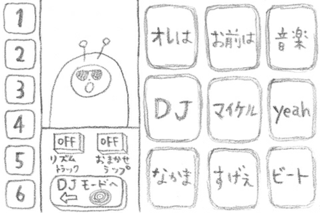
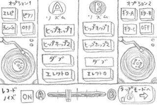
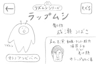
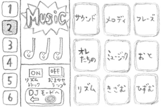
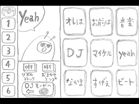
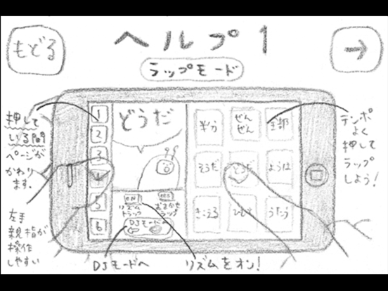
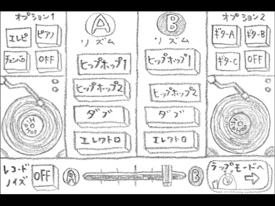
リズムシシリーズ「ラップムシ」 制作 成瀬つばさ 今回はリズムシさんがラップするよ! ラップムシは、ことばのボタンをリズミカルに押していくことで、ラッパー気分を味わえるアプリです。 ことばのページは全部で7つあって、左側の数字ボタンを押している間、切りかわります。 (左手親指で押すのがオススメ。) 「DJモード」では、ABそれぞれのレコードを選んで、DJプレイができます。 下にあるフェーダーで、音量バランスも変えられます。 もちろん、レコードをこすってのスクラッチプレイも可能! オプションでピアノやギターの音もつけられます。 かっこいいトラックにしてみてね。 操作にこまったら、「ラップモード」のリズムシさんをタップすれば、ヘルプがでてきます。 お友達と一緒に、iPhoneを2〜3台使って、ラップ担当、DJ担当にわかれて遊ぶのもおすすめ。 BPMは96になっています。 生演奏とコラボしてみたり、いろいろな遊び方をためしてみてくださいね。 声の出演 新藤・ケント・駿介 *音がでない場合、下記のチェックをお願いします* ・…
App details
What you can learn from ラップムシ
Every shipping app on the App Store has gone through the same decisions you're working through right now: which screenshot goes first, what caption sits over it, which device frame to show, what color the background should be. The 7 screenshots above are ラップムシ's answers to those questions — they're public, they're real, and they made it through Apple's review.
What the numbers say: ラップムシ runs a light set with one background colour (#FCFCFC) carried across every screenshot — the listing reads as a single poster when the shots sit side by side in search results. Hit Use this style to open the editor with these exact colours and drop your own screenshot in.
Notice the first screenshot in particular. It's the one users see in search results and on the product page, and it's where most apps spend their best caption and tightest design. Look at the proportion of background to phone, where the text sits, what one thing the image is trying to communicate.
Want to see how other Music apps approach the same problem? Browse more Music apps in the showcase.
Take what works into your own screenshots
Open LaunchShots and design your App Store & Google Play screenshots — pick a device frame, drop captions, ship in minutes. Free, in your browser.
Open the screenshot editor →Apps with a similar look
Closest background + accent colours among the listings we've analysed — useful when you want to see the same palette handled by a different team.