Chart position — tracked daily by LaunchShots
Screenshot style breakdown
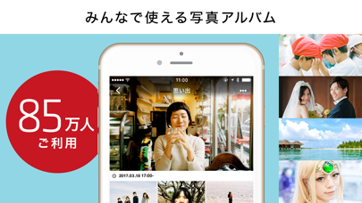
Sampled from 5 of SUZURIアルバム's App Store screenshots — background, accent and theme, measured by LaunchShots (not something Apple publishes).
#FCFCFC bg
#DDDDDD
#94D4E4 accent
#111111 text
Screenshots


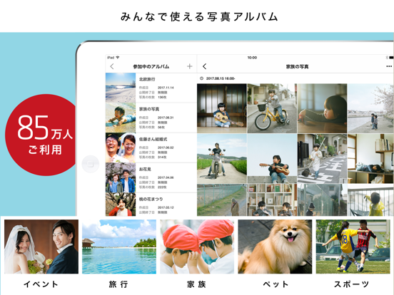
iPad screenshots


Icon palette
About this app
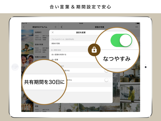
「SUZURIアルバム」(旧30days Album)は、 これまでにお預かりした写真は10億枚を突破しました。 長きにわたりたくさんのお客様にご愛顧いただいております。 イベントや日常の写真をプライベートにも公開にも自在に共有できるオンラインアルバムアプリ。 結婚式や旅行、同窓会、家族行事などで撮った大量の写真を 合い言葉付きの限定共有で安心してシェアしたり、 誰でも見られる公開アルバムとしてSNSで紹介したり、 使い方に応じて、自由に共有方法を選べるのが特徴です。 写真スタジオやカメラマン、幼稚園・保育園、アウトドアアクティビティの参加者への共有など、ビジネス利用でも多数の実績があります。 ▼ SUZURIアルバムの主な機能 ◎かんたん操作 アプリでサクッとアルバム作成&写真アップロード。操作に迷いません。 ◎共有方法が選べる ・【合い言葉】や【期間限定公開】でプライベートな共有が可能 ・合い言葉を設定しなければ、公開アルバムとして誰とでも自由にシェアできます ◎共同アルバムもOK 友達や家族も写真を追加できるから、思い出をみ…
App details
What you can learn from SUZURIアルバム
Every shipping app on the App Store has gone through the same decisions you're working through right now: which screenshot goes first, what caption sits over it, which device frame to show, what color the background should be. The 10 screenshots above are SUZURIアルバム's answers to those questions — they're public, they're real, and they made it through Apple's review.
What the numbers say: SUZURIアルバム runs a light set where the background shifts from screenshot to screenshot (first shot #FCFCFC) — each image has to stand on its own, so the captions carry more of the story. The accent colour we picked up, #94D4E4, is the one to reuse for badges, arrows and highlighted words if you borrow this look. Hit Use this style to open the editor with these exact colours and drop your own screenshot in.
Notice the first screenshot in particular. It's the one users see in search results and on the product page, and it's where most apps spend their best caption and tightest design. Look at the proportion of background to phone, where the text sits, what one thing the image is trying to communicate.
Want to see how other Photo & Video apps approach the same problem? Browse more Photo & Video apps in the showcase.
Take what works into your own screenshots
Open LaunchShots and design your App Store & Google Play screenshots — pick a device frame, drop captions, ship in minutes. Free, in your browser.
Open the screenshot editor →Apps with a similar look
Closest background + accent colours among the listings we've analysed — useful when you want to see the same palette handled by a different team.