Chart position — tracked daily by LaunchShots
Screenshot style breakdown
Sampled from 6 of GIG-Kuwait's App Store screenshots — background, accent and theme, measured by LaunchShots (not something Apple publishes).
#14047C bg
#34278E
#D48C64 accent
#FFFFFF text
Reading the caption text from the screenshots in your browser…
Screenshots


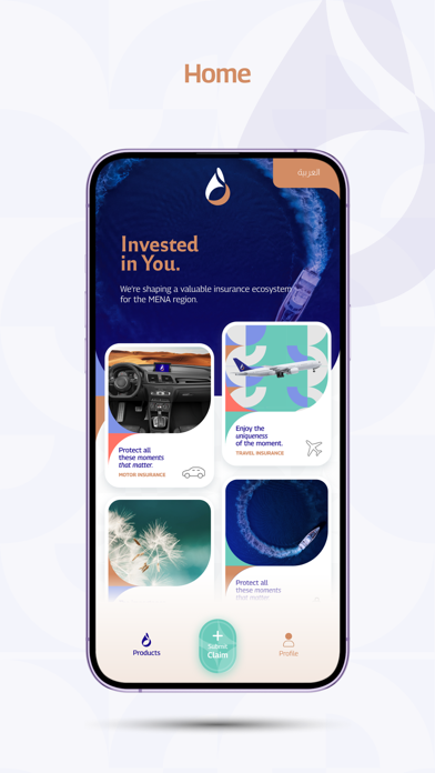


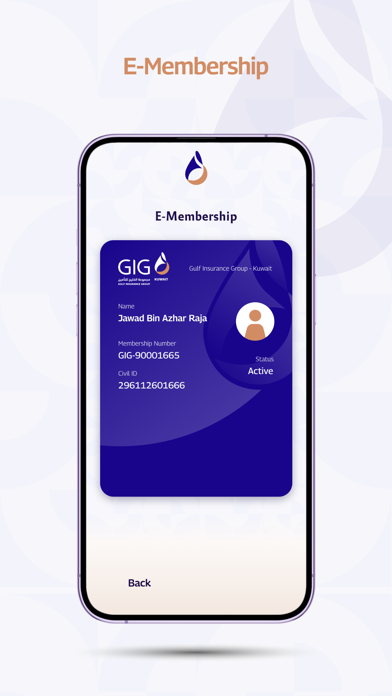

Icon palette
About this app
مرحبًا بكم في تطبيق مجموعة الخليج للتأمين - الكويت (GIG-Kuwait) الجديد الذي يقدم لك تجربة فريدة من نوعها. تمنحك GIG-Kuwait تجربة عملاء مميزة من خلال التمكن من الوصول إلى جميع منتجاتنا وخدماتنا الملائمة لك. يمكنك إنشاء ملف تعريف وشراء وتجديد وثائق التأمين الخاصة بك مع القدرة على الدفع من خلال بوابة الدفع الالكتروني (كي- نت ) أو بطاقات الائتمان. يتيح لك تطبيقGIG-Kuwait للهاتف المحمول : 1. إنشاء وإدارة حسابك الخاص. 2. شراء وتجديد وثائق التأمين. 3. تقديم ومتابعة المطالبات. 4. التعرف على مزايا المنتجات أو الخدمات التأمينية. 5. البحث عن مواقع فروع GIG-Kuwait وكيفية الوصول إليها. 6. البحث عن مزودي خدمة الشبكة الطبية. 7. الحصول على آخر العروض والأخبار. Welcome to the new Gulf Insurance Group-Kuwait (GIG-Kuwait) application that offers you a unique and improved experience. GIG-Kuwait gives you an enhanced customer experience by enabling access to all our products and services at your co…
App details
What you can learn from GIG-Kuwait
Every shipping app on the App Store has gone through the same decisions you're working through right now: which screenshot goes first, what caption sits over it, which device frame to show, what color the background should be. The 8 screenshots above are GIG-Kuwait's answers to those questions — they're public, they're real, and they made it through Apple's review.
What the numbers say: GIG-Kuwait runs a mixed light-and-dark set where the background shifts from screenshot to screenshot (first shot #14047C) — each image has to stand on its own, so the captions carry more of the story. The accent colour we picked up, #D48C64, is the one to reuse for badges, arrows and highlighted words if you borrow this look. Hit Use this style to open the editor with these exact colours and drop your own screenshot in.
Notice the first screenshot in particular. It's the one users see in search results and on the product page, and it's where most apps spend their best caption and tightest design. Look at the proportion of background to phone, where the text sits, what one thing the image is trying to communicate.
Want to see how other Business apps approach the same problem? Browse more Business apps in the showcase.
Take what works into your own screenshots
Open LaunchShots and design your App Store & Google Play screenshots — pick a device frame, drop captions, ship in minutes. Free, in your browser.
Open the screenshot editor →Apps with a similar look
Closest background + accent colours among the listings we've analysed — useful when you want to see the same palette handled by a different team.