Chart position — tracked daily by LaunchShots
Screenshot changes — detected by LaunchShots
Screenshot style breakdown
Sampled from 6 of Bitrix24's App Store screenshots — background, accent and theme, measured by LaunchShots (not something Apple publishes).
#143CFC bg
#3457FC
#3CBCFC accent
#FFFFFF text
Screenshots


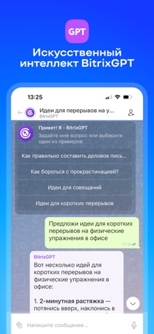

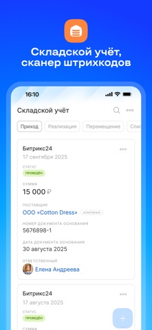
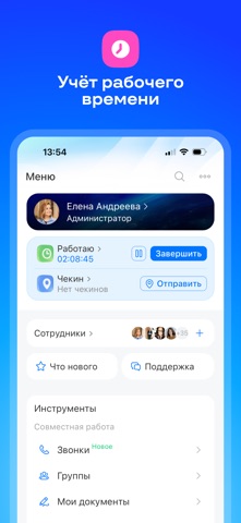
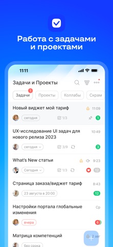


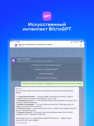
iPad screenshots




Icon palette
About this app
Битрикс24 — корпоративный мессенджер, CRM и задачи с ИИ-помощником в одном приложении. Общайтесь с командой в чатах и по видеосвязи, ведите клиентов и сделки, управляйте проектами прямо со смартфона. Есть бесплатный тариф для неограниченного числа пользователей. Корпоративный мессенджер и видеозвонки Рабочие чаты, обмен файлами, аудио- и видеозвонки с коллегами и клиентами. Нейросеть расшифрует встречу, сделает краткий пересказ и зафиксирует договорённости. BitrixGPT — ИИ-помощник для работы Подготовит текст, сделает краткую выжимку, предложит идеи и поможет разобраться в рабочем вопросе. Меньше рутины — больше времени на задачи. CRM: учёт клиентов и сделок Не упускайте клиентов даже в пути: отвечайте на обращения, следите за сделками и воронкой продаж со смартфона. BitrixGPT проанализирует звонки и переписку и сохранит ключевые договорённости в CRM. Задачи: таск-менеджер для команд…
App details
What you can learn from Bitrix24
Every shipping app on the App Store has gone through the same decisions you're working through right now: which screenshot goes first, what caption sits over it, which device frame to show, what color the background should be. The 20 screenshots above are Bitrix24's answers to those questions — they're public, they're real, and they made it through Apple's review.
What the numbers say: Bitrix24 runs a mixed light-and-dark set where the background shifts from screenshot to screenshot (first shot #143CFC) — each image has to stand on its own, so the captions carry more of the story. The accent colour we picked up, #3CBCFC, is the one to reuse for badges, arrows and highlighted words if you borrow this look. Hit Use this style to open the editor with these exact colours and drop your own screenshot in.
Notice the first screenshot in particular. It's the one users see in search results and on the product page, and it's where most apps spend their best caption and tightest design. Look at the proportion of background to phone, where the text sits, what one thing the image is trying to communicate.
Want to see how other Business apps approach the same problem? Browse more Business apps in the showcase.
Take what works into your own screenshots
Open LaunchShots and design your App Store & Google Play screenshots — pick a device frame, drop captions, ship in minutes. Free, in your browser.
Open the screenshot editor →Apps with a similar look
Closest background + accent colours among the listings we've analysed — useful when you want to see the same palette handled by a different team.