Chart position — tracked daily by LaunchShots
Screenshot style breakdown
Sampled from 6 of 知唱音域音调仪's App Store screenshots — background, accent and theme, measured by LaunchShots (not something Apple publishes).
#7484F4 bg
#8795F5
#845C34 accent
#FFFFFF text
Screenshots


iPad screenshots


Icon palette
About this app
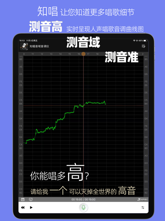
知唱音域音调仪是一款可以实时分析并显示您歌唱音调、音高曲线图的实用工具,不仅能够方便快捷地测试您的音域,还可以体现唱歌中的音准、气息问题,同时可以观测到颤音、尾音处理等技巧运用时的微妙变化。 知唱音域音调仪的特性 1.易用性 对于大部分没接触过钢琴等乐器、没学过音乐理论知识的朋友而言,知唱的这款歌唱音调仪能够大大地降低使用门槛。 您无需对着钢琴一遍遍地弹,然后跟着一遍遍地唱,在没有指导老师纠正的情况下,你也不知道自己唱得对不对。 而现在您只需要对着手机麦克风进行哼唱,就能自动识别分析出您唱的是哪个音、哪个调、唱得准不准。 2.直观性 歌唱音调曲线所对应的横轴和纵轴,可以清晰地看出对应时间点的音高与音名所对应的关系,您可以通过左右、上下滚动、以及缩放的方式,来察看全局和细节信息。 3.实时性 与录完音后再经过算法识别音调音高不同的是,知唱的这款歌唱音调仪是实时性的。 通过实时接收麦克风的音频信号,将人声的音高频率与音名关系对应起来,即时通过音调曲线的形式展现屏幕上。 您可以根据看到的歌唱音调曲线,实时…
App details
What you can learn from 知唱音域音调仪
Every shipping app on the App Store has gone through the same decisions you're working through right now: which screenshot goes first, what caption sits over it, which device frame to show, what color the background should be. The 11 screenshots above are 知唱音域音调仪's answers to those questions — they're public, they're real, and they made it through Apple's review.
What the numbers say: 知唱音域音调仪 runs a dark set with one background colour (#7484F4) carried across every screenshot — the listing reads as a single poster when the shots sit side by side in search results. The accent colour we picked up, #845C34, is the one to reuse for badges, arrows and highlighted words if you borrow this look. Hit Use this style to open the editor with these exact colours and drop your own screenshot in.
Notice the first screenshot in particular. It's the one users see in search results and on the product page, and it's where most apps spend their best caption and tightest design. Look at the proportion of background to phone, where the text sits, what one thing the image is trying to communicate.
Want to see how other Music apps approach the same problem? Browse more Music apps in the showcase.
Take what works into your own screenshots
Open LaunchShots and design your App Store & Google Play screenshots — pick a device frame, drop captions, ship in minutes. Free, in your browser.
Open the screenshot editor →Apps with a similar look
Closest background + accent colours among the listings we've analysed — useful when you want to see the same palette handled by a different team.