Chart position — tracked daily by LaunchShots
Screenshot changes — detected by LaunchShots
Screenshot style breakdown
Sampled from 6 of DPIP - 災害天氣與地震速報's App Store screenshots — background, accent and theme, measured by LaunchShots (not something Apple publishes).
#ACC4AC bg
#97AC97
#3C846C accent
#111111 text
Screenshots
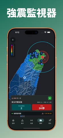
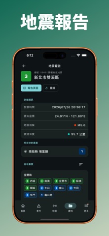


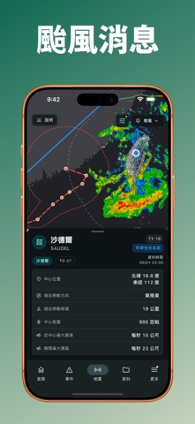


iPad screenshots


Icon palette
About this app
DPIP(Disaster Prevention Information Platform,防災資訊整合平台)是由臺灣本土團隊開發的防災應用程式,整合中央氣象署、國家災害防救科技中心、日本氣象廳及 TREM-Net 等資料來源,將地震速報、即時震度、海嘯、天氣、颱風與各類災害示警集中在同一個 App,協助你快速掌握身邊的防災資訊。 ※ DPIP 提供的資訊僅供防災參考,實際災害資訊及避難指示請以政府主管機關公告為準。 ※ 歡迎加入公開測試以取得最新測試版本。 ※ 如有問題或建議,歡迎透過 App 內的社群連結與我們聯絡。 地震發生時,DPIP 可提供強震即時警報、所在地預估震度與搖晃預估抵達倒數;同時透過 TREM-Net 觀測站呈現各地即時震度。你也可以查詢中央氣象署發布的地震報告,掌握震央、規模、深度及各地震度分布。 當中央氣象署發布海嘯資訊時,DPIP 可顯示海嘯警報、來源地震、沿岸預估抵達時間與波高,以及各觀測站實際觀測到的海嘯資訊,協助你掌握可能受影響的地區。 除了地震與海嘯資訊,DPIP 也整合即時天氣、雨量趨勢、雷達回波、未來一小時降水預報、閃電、風向風速、衛星雲圖與颱風…
App details
What you can learn from DPIP - 災害天氣與地震速報
Every shipping app on the App Store has gone through the same decisions you're working through right now: which screenshot goes first, what caption sits over it, which device frame to show, what color the background should be. The 14 screenshots above are DPIP - 災害天氣與地震速報's answers to those questions — they're public, they're real, and they made it through Apple's review.
What the numbers say: DPIP - 災害天氣與地震速報 runs a light set with one background colour (#ACC4AC) carried across every screenshot — the listing reads as a single poster when the shots sit side by side in search results. The accent colour we picked up, #3C846C, is the one to reuse for badges, arrows and highlighted words if you borrow this look. Hit Use this style to open the editor with these exact colours and drop your own screenshot in.
Notice the first screenshot in particular. It's the one users see in search results and on the product page, and it's where most apps spend their best caption and tightest design. Look at the proportion of background to phone, where the text sits, what one thing the image is trying to communicate.
Want to see how other Weather apps approach the same problem? Browse more Weather apps in the showcase.
Take what works into your own screenshots
Open LaunchShots and design your App Store & Google Play screenshots — pick a device frame, drop captions, ship in minutes. Free, in your browser.
Open the screenshot editor →Apps with a similar look
Closest background + accent colours among the listings we've analysed — useful when you want to see the same palette handled by a different team.