Chart position — tracked daily by LaunchShots
Screenshot style breakdown
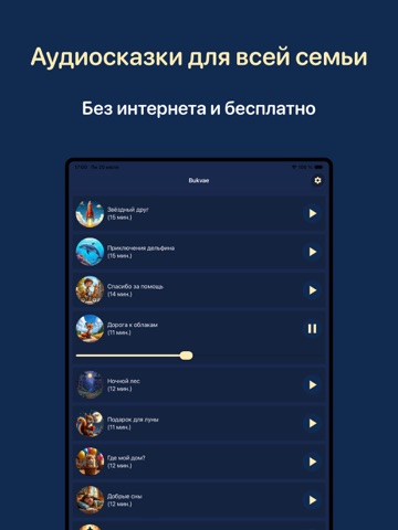
Sampled from 6 of Сказки на ночь. Аудиосказки's App Store screenshots — background, accent and theme, measured by LaunchShots (not something Apple publishes).
#142444 bg
#34425E
#4C8CB4 accent
#FFFFFF text
Reading the caption text from the screenshots in your browser…
Screenshots


iPad screenshots



Icon palette
About this app
Сказки на ночь, аудиосказки и маленькие аудиокниги BUKVAE. Добро пожаловать в мир волшебных сказок и историй BUKVAE. Это приложение создано с любовью и заботой, папой и мамой для таких же родителей, чтобы помочь детям расслабиться, успокоиться и легко уснуть. Просто включите малышу наши добрые аудиосказки на ночь и подарите себе несколько минут покоя. Слушая истории, ребенок погружается в атмосферу добра, уюта и чудес. Можно все сказки слушать бесплатно и без интернета. Каждая сказка сопровождается мягкой колыбельной фоновой музыкой, которая помогает малышу успокоиться и заснуть крепким сном. Голос рассказчика звучит спокойно и уверенно, создавая ощущение безопасности и тепла. Эти аудиосказки становятся любимым ритуалом перед сном и помогают детям засыпать с улыбкой. Что вас ждет в приложении BUKVAE: * бесплатные современные сказки на ночь * детская Библия в адаптированном формате *…
App details
What you can learn from Сказки на ночь. Аудиосказки
Every shipping app on the App Store has gone through the same decisions you're working through right now: which screenshot goes first, what caption sits over it, which device frame to show, what color the background should be. The 12 screenshots above are Сказки на ночь. Аудиосказки's answers to those questions — they're public, they're real, and they made it through Apple's review.
What the numbers say: Сказки на ночь. Аудиосказки runs a dark set with one background colour (#142444) carried across every screenshot — the listing reads as a single poster when the shots sit side by side in search results. The accent colour we picked up, #4C8CB4, is the one to reuse for badges, arrows and highlighted words if you borrow this look. Hit Use this style to open the editor with these exact colours and drop your own screenshot in.
Notice the first screenshot in particular. It's the one users see in search results and on the product page, and it's where most apps spend their best caption and tightest design. Look at the proportion of background to phone, where the text sits, what one thing the image is trying to communicate.
Want to see how other Book apps approach the same problem? Browse more Book apps in the showcase.
Take what works into your own screenshots
Open LaunchShots and design your App Store & Google Play screenshots — pick a device frame, drop captions, ship in minutes. Free, in your browser.
Open the screenshot editor →Apps with a similar look
Closest background + accent colours among the listings we've analysed — useful when you want to see the same palette handled by a different team.