Chart position — tracked daily by LaunchShots
Screenshot style breakdown
Sampled from 3 of Trahel | ترحَّل's App Store screenshots — background, accent and theme, measured by LaunchShots (not something Apple publishes).
#44A4F4 bg
#3B90D6
#9CCCF4 accent
#111111 text
Screenshots


iPad screenshots

Icon palette
About this app
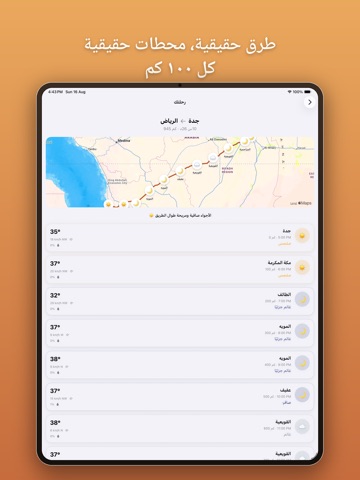
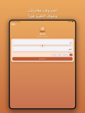
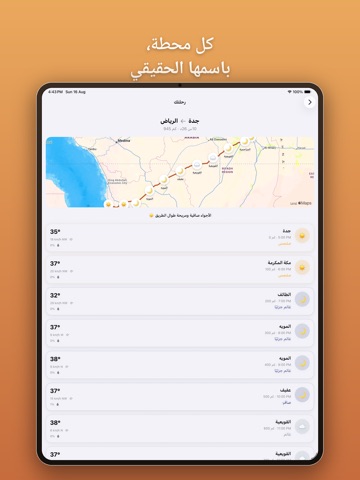
ترحّل يخطط لك الطريق بين أي مدينتين سعوديتين — ويوريك بالضبط وش الطقس اللي بتواجهه على طول الطريق. اختر مدينة البداية والوجهة من أكبر مدن السعودية، وحدد وقت مغادرتك، وترحّل يرسم لك المسار الفعلي بينهم — مو خط مستقيم، الطريق السريع الحقيقي. بعدين يتحقق من توقعات الطقس كل ١٠٠ كم على طول المسار، بالتوقيت اللي بتوصل فيه فعليًا لكل نقطة، عشان تعرف إذا بتسوق تحت شمس أو رياح أو مطر بعد ثلاث ساعات — مو بس شكل الجو عندك الحين. وش بتحصل عليه • مسارات حقيقية — اتجاهات قيادة على شبكة الطرق الفعلية بين المدن السعودية، بالاتجاهين • توقعات كل ~١٠٠ كم — درجة الحرارة والرياح واحتمال المطر لكل محطة، مو بس وجهتك • أسماء أماكن حقيقية — كل محطة معنونة بأقرب بلدة فعلية، أبدًا إحداثيات مجردة • اختر وقت مغادرتك — الآن، بعد ٣ ساعات، الليلة، أو بكرة الصبح، وشوف كيف يتغيّر الطقس • دقة النهار والليل — السماء الصافية تختلف الساعة ٣ عصرًا عن ٩ مساءً، وترحّل يعرف الفرق • ثنائي اللغة بالكامل — كل شاشة وكل اسم مدينة…
App details
What you can learn from Trahel | ترحَّل
Every shipping app on the App Store has gone through the same decisions you're working through right now: which screenshot goes first, what caption sits over it, which device frame to show, what color the background should be. The 7 screenshots above are Trahel | ترحَّل's answers to those questions — they're public, they're real, and they made it through Apple's review.
What the numbers say: Trahel | ترحَّل runs a light set where the background shifts from screenshot to screenshot (first shot #44A4F4) — each image has to stand on its own, so the captions carry more of the story. The accent colour we picked up, #9CCCF4, is the one to reuse for badges, arrows and highlighted words if you borrow this look. Hit Use this style to open the editor with these exact colours and drop your own screenshot in.
Notice the first screenshot in particular. It's the one users see in search results and on the product page, and it's where most apps spend their best caption and tightest design. Look at the proportion of background to phone, where the text sits, what one thing the image is trying to communicate.
Want to see how other Weather apps approach the same problem? Browse more Weather apps in the showcase.
Take what works into your own screenshots
Open LaunchShots and design your App Store & Google Play screenshots — pick a device frame, drop captions, ship in minutes. Free, in your browser.
Open the screenshot editor →Apps with a similar look
Closest background + accent colours among the listings we've analysed — useful when you want to see the same palette handled by a different team.