Chart position — tracked daily by LaunchShots
Screenshot changes — detected by LaunchShots
Screenshot style breakdown
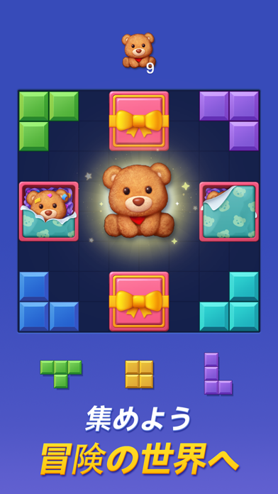
Sampled from 5 of カラーブロック コンボブラスト's App Store screenshots — background, accent and theme, measured by LaunchShots (not something Apple publishes).
#344CBC bg
#5065C5
#14244C accent
#FFFFFF text
Screenshots
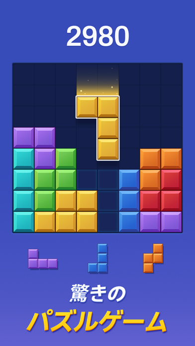
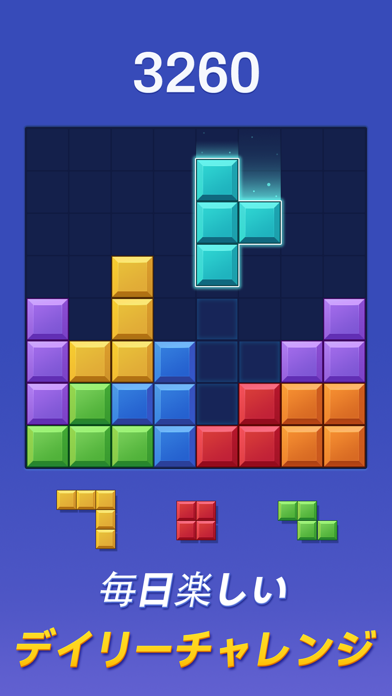
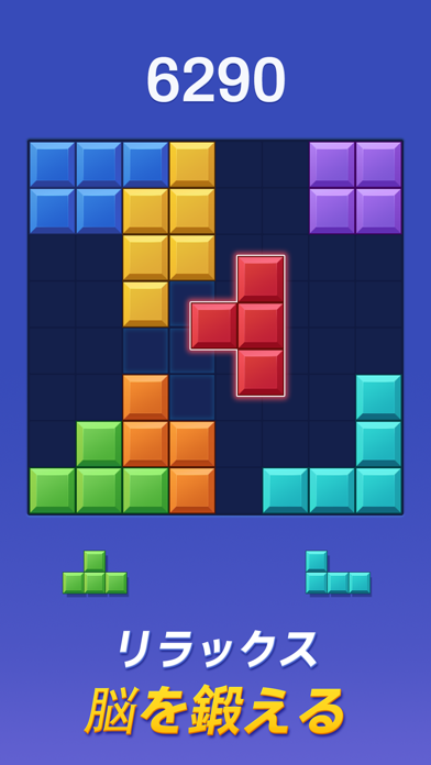
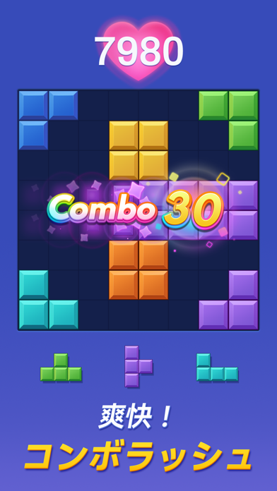
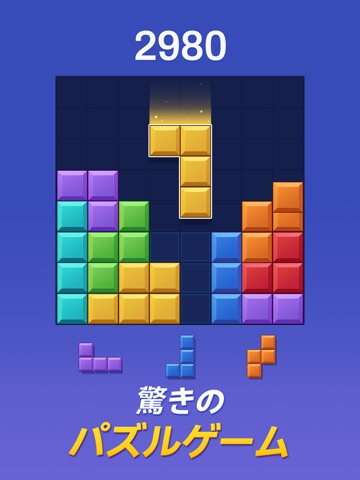
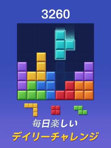
iPad screenshots


Icon palette
About this app
カラーブロックは、ブロックを置いてラインを消すだけのシンプルなブロックパズル。 通勤中のちょっとした暇つぶしから、じっくり頭を使う脳トレまで、その日の気分に合わせて遊べる無料のパズルゲームです。 ■ ルールはかんたん、奥行きはしっかり 8×8のグリッドに、出てきたブロックをドラッグ&ドロップで置いていく。 縦か横の1列がすべて埋まると、その列が消えてスコアになります。 覚えることはこれだけ。チュートリアルを読まなくても、最初の1分から遊べます。 ただし、ブロックは回転できません。だからこそ「どこに置くか」の一手が効いてきます。空きマスの形を見ながら、次に来るブロックの置き場所を残しておく。 この読み合いが、ただのパズルゲームを手軽な脳トレに変えていきます。 ■ コンボがつながる瞬間が気持ちいい 3手以内にライン消去を重ねると、コンボが継続してスコアが加速します。 定番の“ブロック・ブラスト”体験を今風にアップデートし、ブロックが消える瞬間の色とアニメーションを気持ちよく仕上げました。 狙って組んだ連鎖が決…
App details
What you can learn from カラーブロック コンボブラスト
Every shipping app on the App Store has gone through the same decisions you're working through right now: which screenshot goes first, what caption sits over it, which device frame to show, what color the background should be. The 10 screenshots above are カラーブロック コンボブラスト's answers to those questions — they're public, they're real, and they made it through Apple's review.
What the numbers say: カラーブロック コンボブラスト runs a dark set with one background colour (#344CBC) carried across every screenshot — the listing reads as a single poster when the shots sit side by side in search results. The accent colour we picked up, #14244C, is the one to reuse for badges, arrows and highlighted words if you borrow this look. Hit Use this style to open the editor with these exact colours and drop your own screenshot in.
Notice the first screenshot in particular. It's the one users see in search results and on the product page, and it's where most apps spend their best caption and tightest design. Look at the proportion of background to phone, where the text sits, what one thing the image is trying to communicate.
Want to see how other Games apps approach the same problem? Browse more Games apps in the showcase.
Take what works into your own screenshots
Open LaunchShots and design your App Store & Google Play screenshots — pick a device frame, drop captions, ship in minutes. Free, in your browser.
Open the screenshot editor →Apps with a similar look
Closest background + accent colours among the listings we've analysed — useful when you want to see the same palette handled by a different team.