Chart position — tracked daily by LaunchShots
Screenshot style breakdown
Sampled from 6 of التفسير المحرر's App Store screenshots — background, accent and theme, measured by LaunchShots (not something Apple publishes).
#FCFCF4 bg
#DDDDD6
#648C54 accent
#111111 text
Reading the caption text from the screenshots in your browser…
Screenshots
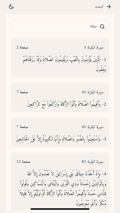
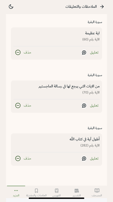
Icon palette
About this app
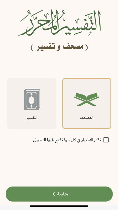
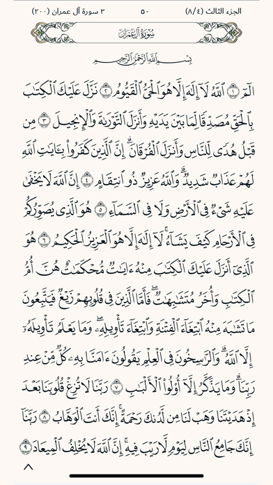
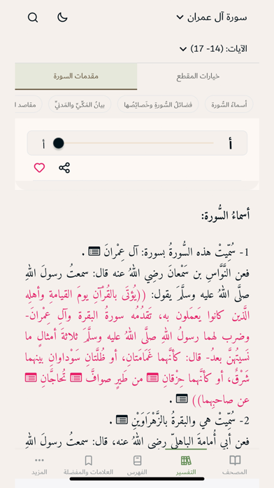
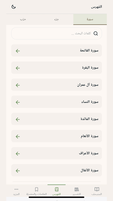
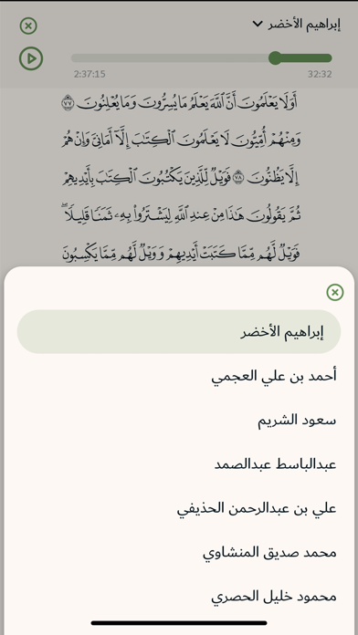
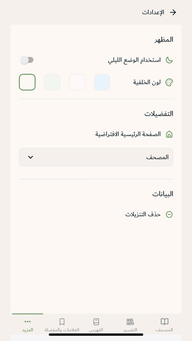
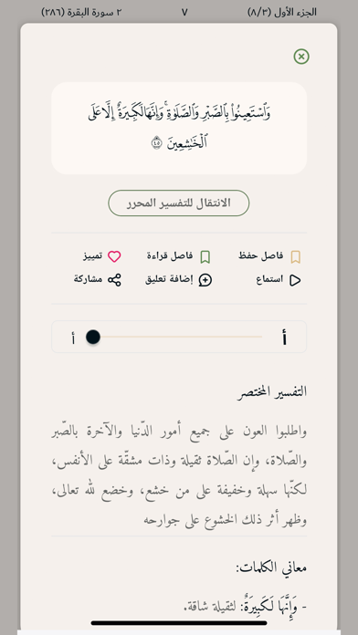
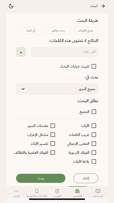
تطبيق يحوي عددًا كبيرًا من المميِّزات المتطوِّرة، ويشتمل على (مصحف و تفسير) أما المصحف فقد اعتمد فيه على نسخة رقمية من مصحف المدينة النبوية الذي أصدره مُجمَّع الملك فهد لطباعة المصحف الشريف برواية حفص عن عاصم، وأما التفسير فقد اعتمد فيه على التفسير المحرر وهو موسوعة تفسيرية ضخمة مطبوعة في 44 مجلدا من إصدار المؤسسة وقد اعتمد منهجيّة التّفسير ثلّةٌ من المتخصّصين في مجال الدّراسات القرآنيّة وعلومها، وهم: - الشّيخ الدكتور: خالد بن عثمان السّبت أستاذ التّفسير بجامعة الإمام عبد الرّحمن بن فيصل بالدمام. - الشّيخ الدكتور: أحمد سعد الخطيب أستاذ التّفسير بجامعة الأزهر بقنا. - الشّيخ الدكتور: عبد الرّحمن بن معاضة الشهريّ أستاذ التّفسير بجامعة الملك سعود بالرياض. - الشّيخ الدكتور: مساعد بن سليمان الطّيّار أستاذ التّفسير بجامعة الملك سعود بالرياض. - الشّيخ الدكتور: منصور بن حمد العيدي أستاذ التّفسير بجامعة الإمام عبد الرّحمن بن فيصل بالدمام. مميزات التطبيق: - ربط كامل قاعدة بيانات المادَّة…
App details
What you can learn from التفسير المحرر
Every shipping app on the App Store has gone through the same decisions you're working through right now: which screenshot goes first, what caption sits over it, which device frame to show, what color the background should be. The 10 screenshots above are التفسير المحرر's answers to those questions — they're public, they're real, and they made it through Apple's review.
What the numbers say: التفسير المحرر runs a light set with one background colour (#FCFCF4) carried across every screenshot — the listing reads as a single poster when the shots sit side by side in search results. The accent colour we picked up, #648C54, is the one to reuse for badges, arrows and highlighted words if you borrow this look. Hit Use this style to open the editor with these exact colours and drop your own screenshot in.
Notice the first screenshot in particular. It's the one users see in search results and on the product page, and it's where most apps spend their best caption and tightest design. Look at the proportion of background to phone, where the text sits, what one thing the image is trying to communicate.
Want to see how other Education apps approach the same problem? Browse more Education apps in the showcase.
Take what works into your own screenshots
Open LaunchShots and design your App Store & Google Play screenshots — pick a device frame, drop captions, ship in minutes. Free, in your browser.
Open the screenshot editor →Apps with a similar look
Closest background + accent colours among the listings we've analysed — useful when you want to see the same palette handled by a different team.