Screenshot style breakdown
Sampled from 6 of Mini World Royale's App Store screenshots — background, accent and theme, measured by LaunchShots (not something Apple publishes).
#3454EC bg
#506BEE
#9CD4FC accent
#FFFFFF text
Screenshots


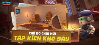


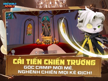
iPad screenshots


Icon palette
About this app
MINI WORLD ROYALE: BẮN CHILL, FEEL GOOD – GAME FPS THẾ HỆ MỚI! TRẢI NGHIỆM KHÁC BIỆT: BẮN CHILL, FEEL GOOD! Chào mừng bạn đến với Mini World Royale – siêu phẩm FPS phong cách Sandbox mới nhất mang đến cảm giác "Bắn chill, feel good" cực sảng khoái! Không còn những chiến trường u ám, Mini World Royale mở ra một thế giới rực rỡ sắc màu, nơi bạn có thể vừa giải trí nhẹ nhàng vừa phô diễn kỹ năng xạ thủ đỉnh cao. SỰ KẾ THỪA HOÀN HẢO TỪ CÁC TỰA GAME HUYỀN THOẠI Nếu bạn đã từng mê mẩn những pha đọ súng kinh điển hay nhịp độ sinh tồn cực cháy của các tựa game game FPS, thì Mini World Royale chắc chắn sẽ không làm bạn thất vọng. Chúng tôi mang đến lối chơi bắn súng quen thuộc nhưng được bao phủ bởi lớp áo "Mini World" tươi mới, tạo nên trải nghiệm vừa lạ vừa quen, đầy cuốn hút. CÁC CHẾ ĐỘ CHƠI "GÂY NGHIỆN" Đừng để vẻ ngoài đáng yêu đánh lừa, Mini World Royale sở hữu những chế độ chiến đấu "căng…
App details
What you can learn from Mini World Royale
Every shipping app on the App Store has gone through the same decisions you're working through right now: which screenshot goes first, what caption sits over it, which device frame to show, what color the background should be. The 14 screenshots above are Mini World Royale's answers to those questions — they're public, they're real, and they made it through Apple's review.
What the numbers say: Mini World Royale runs a dark set where the background shifts from screenshot to screenshot (first shot #3454EC) — each image has to stand on its own, so the captions carry more of the story. The accent colour we picked up, #9CD4FC, is the one to reuse for badges, arrows and highlighted words if you borrow this look. Hit Use this style to open the editor with these exact colours and drop your own screenshot in.
Notice the first screenshot in particular. It's the one users see in search results and on the product page, and it's where most apps spend their best caption and tightest design. Look at the proportion of background to phone, where the text sits, what one thing the image is trying to communicate.
Want to see how other Games apps approach the same problem? Browse more Games apps in the showcase.
Take what works into your own screenshots
Open LaunchShots and design your App Store & Google Play screenshots — pick a device frame, drop captions, ship in minutes. Free, in your browser.
Open the screenshot editor →Apps with a similar look
Closest background + accent colours among the listings we've analysed — useful when you want to see the same palette handled by a different team.