Chart position — tracked daily by LaunchShots
Screenshot changes — detected by LaunchShots
Screenshot style breakdown
Sampled from 6 of 宝宝课堂's App Store screenshots — background, accent and theme, measured by LaunchShots (not something Apple publishes).
#84948C bg
#74827B
#FC9CC4 accent
#111111 text
Screenshots

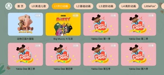

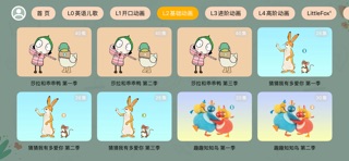


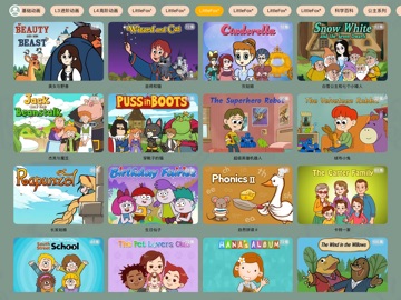
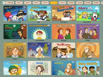
iPad screenshots


Icon palette
About this app
英语启蒙,不用东拼西凑。 看动画、听儿歌——宝宝课堂,一站式搞定! 【看 · 看得懂】 分级英语动画,从字母、单词到绘本故事逐级进阶。画面即语境,孩子不看字幕也能明白。 【听 · 听得清】 原声儿歌、韵律童谣、睡前故事循环播放。刷牙、吃饭、坐车,碎片时间都在磨耳朵。 【说 · 说得出】 逐句跟读+发音测评,哪里不准点哪里,开口不再难。 【练 · 练得会】 每日任务、亲子互动、复习提醒,把输入变成输出,学过的不会忘。 【一条路径 四个阶段】 启蒙 → 入门 → 进阶 → 衔接,按年龄与水平自动匹配。2 岁能看,8 岁不嫌浅。 【家长省心】 无广告 · 无弹窗 · 护眼模式 · 电视投屏 · 音频熏听 孩子看得安心,家长用得放心。
App details
What you can learn from 宝宝课堂
Every shipping app on the App Store has gone through the same decisions you're working through right now: which screenshot goes first, what caption sits over it, which device frame to show, what color the background should be. The 11 screenshots above are 宝宝课堂's answers to those questions — they're public, they're real, and they made it through Apple's review.
What the numbers say: 宝宝课堂 runs a light set with one background colour (#84948C) carried across every screenshot — the listing reads as a single poster when the shots sit side by side in search results. The accent colour we picked up, #FC9CC4, is the one to reuse for badges, arrows and highlighted words if you borrow this look. Hit Use this style to open the editor with these exact colours and drop your own screenshot in.
Notice the first screenshot in particular. It's the one users see in search results and on the product page, and it's where most apps spend their best caption and tightest design. Look at the proportion of background to phone, where the text sits, what one thing the image is trying to communicate.
Want to see how other Education apps approach the same problem? Browse more Education apps in the showcase.
Take what works into your own screenshots
Open LaunchShots and design your App Store & Google Play screenshots — pick a device frame, drop captions, ship in minutes. Free, in your browser.
Open the screenshot editor →Apps with a similar look
Closest background + accent colours among the listings we've analysed — useful when you want to see the same palette handled by a different team.