Chart position — tracked daily by LaunchShots
Screenshot changes — detected by LaunchShots
Screenshot style breakdown
Sampled from 4 of الشعر ديوان العرب's App Store screenshots — background, accent and theme, measured by LaunchShots (not something Apple publishes).
#948CC4 bg
#827BAC
#5C34B4 accent
#111111 text
Reading the caption text from the screenshots in your browser…
Screenshots


iPad screenshots




Icon palette
About this app
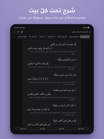
تطبيق "الشعر ديوان العرب" هو نافذتك إلى عالم الشعر العربي؛ من القصائد الجاهلية المليئة بالفخر والحماسة، وحتى إبداعات شعراء العصر الحديث. يأخذك التطبيق في رحلة زمنية عبر العصور لتتعرف على ملامح كل حقبة، وما أبدعته من أشعار وأساليب أدبية خالدة. ويتجاوز التطبيق مجرد القراءة ليمنحك تجربة صوتية ومرئية وتفاعلية متكاملة: تفهم كل كلمة من معاجم العرب الكبرى، وتقرأ أخبار القصائد في أمّهات كتب الأدب، وتتحدث مباشرة مع الشعراء، وتسجّل القصيدة بصوتك، وتحوّلها إلى فيديو تشاركه، وتستمع لقراءات قرّاء آخرين، وتحفظ ما تختاره من القصائد حفظًا متدرجًا حتى يثبت في ذاكرتك. المميزات الرئيسية: - جديد - كتب الأدب: تسعة من أمّهات الكتب، منها «الأغاني» و«العقد الفريد» و«الكامل»، تقرؤها دون إنترنت بفهرسٍ وحواشٍ، وتجد تحت القصيدة المواضع التي رُويت فيها، مع بحث في الكتب لا يضرّه اختلاف الهمزات والتشكيل، وقصيدة يومية في الرئيسية مع كتبها (ضمن اشتراك «أصوات القرّاء»). - جديد - في صفحة الشاعر: قصائده المسموعة بضغطة،…
App details
What you can learn from الشعر ديوان العرب
Every shipping app on the App Store has gone through the same decisions you're working through right now: which screenshot goes first, what caption sits over it, which device frame to show, what color the background should be. The 14 screenshots above are الشعر ديوان العرب's answers to those questions — they're public, they're real, and they made it through Apple's review.
What the numbers say: الشعر ديوان العرب runs a light set with one background colour (#948CC4) carried across every screenshot — the listing reads as a single poster when the shots sit side by side in search results. The accent colour we picked up, #5C34B4, is the one to reuse for badges, arrows and highlighted words if you borrow this look. Hit Use this style to open the editor with these exact colours and drop your own screenshot in.
Notice the first screenshot in particular. It's the one users see in search results and on the product page, and it's where most apps spend their best caption and tightest design. Look at the proportion of background to phone, where the text sits, what one thing the image is trying to communicate.
Want to see how other Book apps approach the same problem? Browse more Book apps in the showcase.
Take what works into your own screenshots
Open LaunchShots and design your App Store & Google Play screenshots — pick a device frame, drop captions, ship in minutes. Free, in your browser.
Open the screenshot editor →Apps with a similar look
Closest background + accent colours among the listings we've analysed — useful when you want to see the same palette handled by a different team.