Chart position — tracked daily by LaunchShots
Screenshot style breakdown
Sampled from 6 of English Shadowing: Speak Pro's App Store screenshots — background, accent and theme, measured by LaunchShots (not something Apple publishes).
#0484FC bg
#2795FC
#5CA4E4 accent
#FFFFFF text
Screenshots

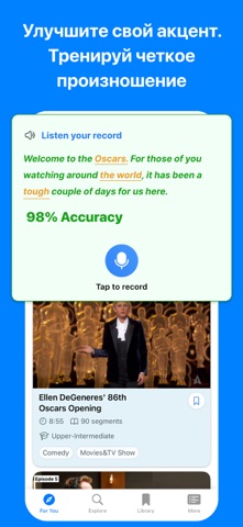


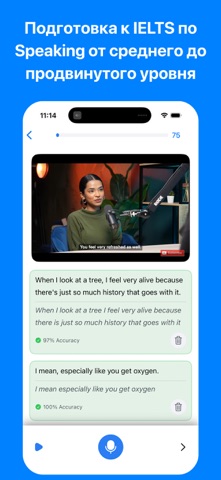
iPad screenshots


Icon palette
About this app
Начни говорить как носитель. Speak Pro превращает реальные видео с YouTube в твою личную студию для разговорной практики. Благодаря проверенной технике шэдуинга, которой пользуются переводчики и полиглоты, ты наконец закроешь разрыв между знанием языка и умением говорить. Шэдуинг — это не простое повторение. Так мозг естественным образом учится беглости. Смотри на носителей, повторяй за ними в реальном времени и тренируй артикуляцию, чтобы говорить с их скоростью. Это секрет уверенной и естественной речи. Идеально для изучения языков, карьерной подготовки или освоения английского, испанского, немецкого, французского, японского и других языков. Реальный контент, реальный прогресс: тренируйся на TED Talks, интервью и повседневных диалогах — а не на заученных учебниковых фразах. Каждая сессия построена на живых голосах и настоящих выражениях. ИИ-обратная связь, как у преподавателя: Зап…
App details
What you can learn from English Shadowing: Speak Pro
Every shipping app on the App Store has gone through the same decisions you're working through right now: which screenshot goes first, what caption sits over it, which device frame to show, what color the background should be. The 11 screenshots above are English Shadowing: Speak Pro's answers to those questions — they're public, they're real, and they made it through Apple's review.
What the numbers say: English Shadowing: Speak Pro runs a dark set with one background colour (#0484FC) carried across every screenshot — the listing reads as a single poster when the shots sit side by side in search results. The accent colour we picked up, #5CA4E4, is the one to reuse for badges, arrows and highlighted words if you borrow this look. Hit Use this style to open the editor with these exact colours and drop your own screenshot in.
Notice the first screenshot in particular. It's the one users see in search results and on the product page, and it's where most apps spend their best caption and tightest design. Look at the proportion of background to phone, where the text sits, what one thing the image is trying to communicate.
Want to see how other Education apps approach the same problem? Browse more Education apps in the showcase.
Take what works into your own screenshots
Open LaunchShots and design your App Store & Google Play screenshots — pick a device frame, drop captions, ship in minutes. Free, in your browser.
Open the screenshot editor →Apps with a similar look
Closest background + accent colours among the listings we've analysed — useful when you want to see the same palette handled by a different team.