Chart position — tracked daily by LaunchShots
Screenshot style breakdown
Sampled from 6 of リヴリヴ 終末スローライフ's App Store screenshots — background, accent and theme, measured by LaunchShots (not something Apple publishes).
#442C84 bg
#5E4995
#5C341C accent
#FFFFFF text
Screenshots
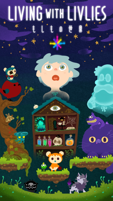
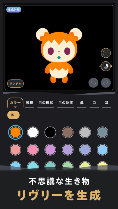
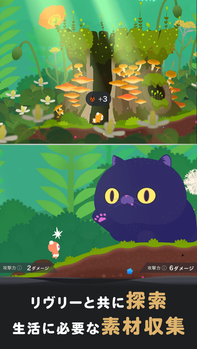
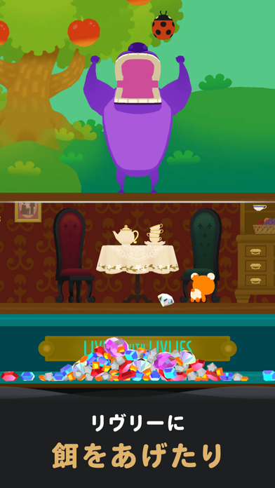
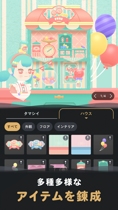
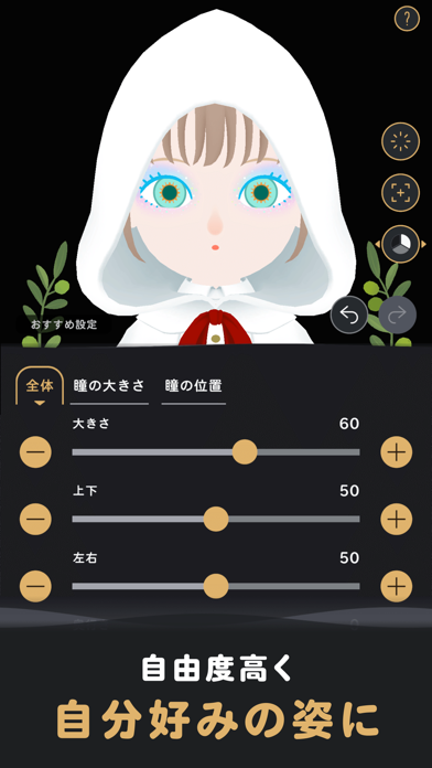
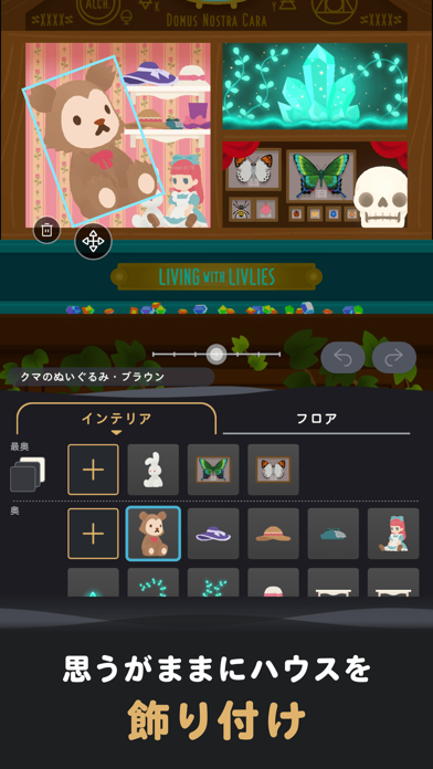
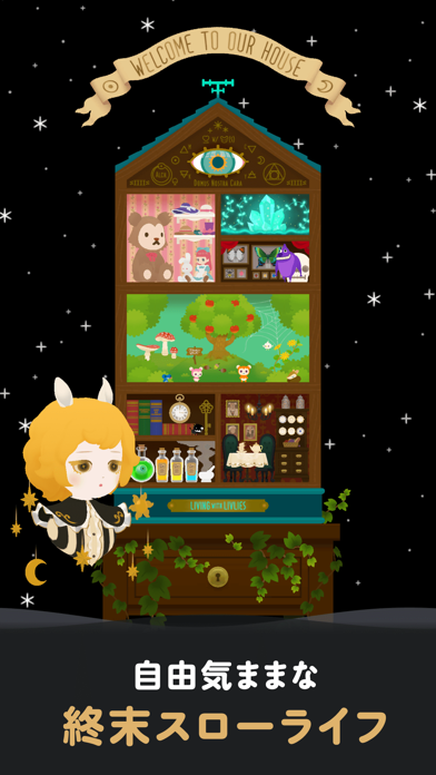
iPad screenshots


Icon palette
About this app
不思議な生き物リヴリーたちと共に生きる終末スローライフ。 錬金術で生み出したリヴリーのからだを借りて、 終末世界を探索しながら暮らしを築いていきます。 いろんなエリアを気ままに探索、 ひたすら新たなリヴリーを生成、 思うがままにアバターやハウスを飾りつける、 ときにはモンスターとの命をかけたバトルなどなど、 もしもの世界であなただけの暮らし方を見つけてみてください。 ◆不思議な生き物「リヴリー」 リヴリーは、錬金術から生まれた人造生物。 虫を食べて宝石のうんちをする、不思議な生き物です。 体の色や模様、パーツの位置や大きさまで調整して、あなただけの相棒を生成しましょう。 ◆ボードゲーム感覚の「探索」 リヴリーのからだを借りて、外の世界を探索しましょう。 難しい操作はいりません。ボードゲームのような気軽な操作感で、 自然を楽しみながらお散歩したり、生活に必要な素材を収集したり、自由なスタイルを楽しめます。 ◆錬金術でアイテムクラフト 探索で集めた素材を組み合わせて、ファッションやインテリアなどのアイテ…
App details
What you can learn from リヴリヴ 終末スローライフ
Every shipping app on the App Store has gone through the same decisions you're working through right now: which screenshot goes first, what caption sits over it, which device frame to show, what color the background should be. The 16 screenshots above are リヴリヴ 終末スローライフ's answers to those questions — they're public, they're real, and they made it through Apple's review.
What the numbers say: リヴリヴ 終末スローライフ runs a dark set where the background shifts from screenshot to screenshot (first shot #442C84) — each image has to stand on its own, so the captions carry more of the story. The accent colour we picked up, #5C341C, is the one to reuse for badges, arrows and highlighted words if you borrow this look. Hit Use this style to open the editor with these exact colours and drop your own screenshot in.
Notice the first screenshot in particular. It's the one users see in search results and on the product page, and it's where most apps spend their best caption and tightest design. Look at the proportion of background to phone, where the text sits, what one thing the image is trying to communicate.
Want to see how other Games apps approach the same problem? Browse more Games apps in the showcase.
Take what works into your own screenshots
Open LaunchShots and design your App Store & Google Play screenshots — pick a device frame, drop captions, ship in minutes. Free, in your browser.
Open the screenshot editor →Apps with a similar look
Closest background + accent colours among the listings we've analysed — useful when you want to see the same palette handled by a different team.