Screenshot changes — detected by LaunchShots
Screenshot style breakdown
Sampled from 6 of 落ちにゃん!(Drop the Cat)'s App Store screenshots — background, accent and theme, measured by LaunchShots (not something Apple publishes).
#74B4FC bg
#669EDD
#F46C74 accent
#111111 text
Screenshots


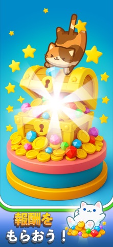
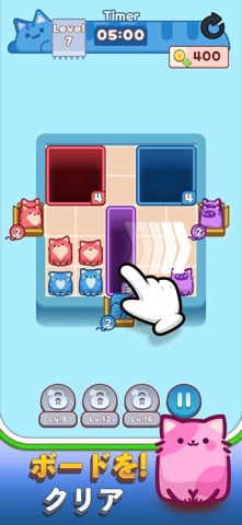


iPad screenshots


Icon palette
About this app
にゃんこドロップ: 楽しいカジュアルパズルゲームの冒険 ようこそ、にゃんこドロップへ! カラフルでかわいいグラフィック、クセになるブロックパズル、頭を使うロジックパズルをひとつにまとめたカジュアルパズルゲームです。やさしいパズルでありながら、心が安らぐ癒しゲームであり、同時に脳を刺激する脳トレでもあります。マッチパズルが好きな方、1分でサクッと遊べるゲームを探している方にぴったりです。 ゲーム紹介 穴を動かして、同じ色のボックスへねこを落とすパズルです。 簡単そう?進めるほどユニークな障害物や複雑なルートが現れ、解くにはひらめきと戦略が必要になります。 主な特徴 覚えるのは簡単、奥は深いパズル設計 見ているだけで癒されるかわいいねこのグラフィック ちょっとした休憩時間にちょうどいい短いステージ スリリングな制限時間が生む本格的な脳トレ 進むほど難しくなる楽しいマッチのしくみ やさしいパズルもロジックパズルも好きな方におすすめ 遊び方 ステージごとに新しいパズルが待っています。 ブロックをスライドさせ…
App details
What you can learn from 落ちにゃん!(Drop the Cat)
Every shipping app on the App Store has gone through the same decisions you're working through right now: which screenshot goes first, what caption sits over it, which device frame to show, what color the background should be. The 16 screenshots above are 落ちにゃん!(Drop the Cat)'s answers to those questions — they're public, they're real, and they made it through Apple's review.
What the numbers say: 落ちにゃん!(Drop the Cat) runs a mixed light-and-dark set where the background shifts from screenshot to screenshot (first shot #74B4FC) — each image has to stand on its own, so the captions carry more of the story. The accent colour we picked up, #F46C74, is the one to reuse for badges, arrows and highlighted words if you borrow this look. Hit Use this style to open the editor with these exact colours and drop your own screenshot in.
Notice the first screenshot in particular. It's the one users see in search results and on the product page, and it's where most apps spend their best caption and tightest design. Look at the proportion of background to phone, where the text sits, what one thing the image is trying to communicate.
Want to see how other Games apps approach the same problem? Browse more Games apps in the showcase.
Take what works into your own screenshots
Open LaunchShots and design your App Store & Google Play screenshots — pick a device frame, drop captions, ship in minutes. Free, in your browser.
Open the screenshot editor →Apps with a similar look
Closest background + accent colours among the listings we've analysed — useful when you want to see the same palette handled by a different team.