Chart position — tracked daily by LaunchShots
Screenshot style breakdown
Sampled from 6 of Wispy: Разговорный английский's App Store screenshots — background, accent and theme, measured by LaunchShots (not something Apple publishes).
#0C0C0C bg
#2E2E2E
#FC74DC accent
#FFFFFF text
Screenshots

Icon palette
About this app
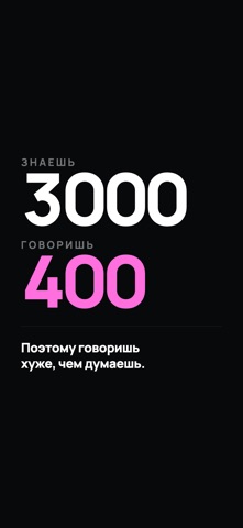
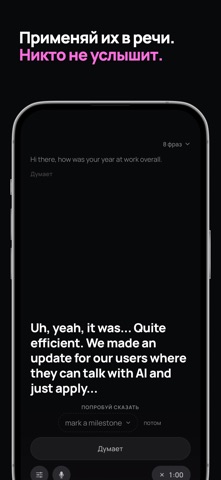
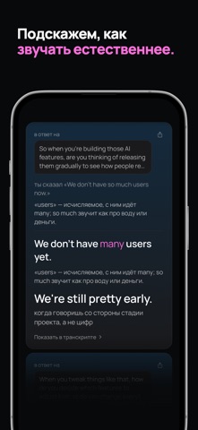
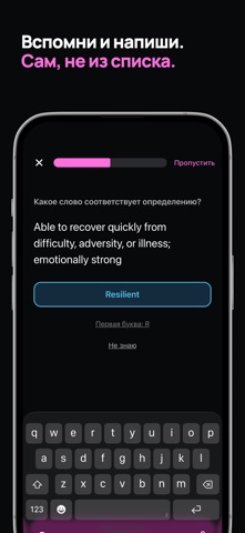
С английским у тебя всё в порядке. Читаешь, переписываешься, работаешь на нём. А когда надо ответить вслух и без паузы — выходят короткие правильные предложения, и ты звучишь проще, чем ты есть. Дело не в том, что ты мало знаешь. Ты узнаёшь тысячи слов, а говоришь несколькими сотнями. Wispy работает с этим разрывом — и считает, что из него реально вышло в речь. КАК ЭТО УСТРОЕНО 1. Находим слова, которые ты узнаёшь, но не говоришь. Из уроков, сериалов, словаря, твоих же разговоров — те, что ты поймёшь сразу и никогда не произнесёшь. 2. Доводим их до готовности. Карточки, повторения, интервалы — скучная часть, которая обязана случиться. Но она не двигает твою цифру: узнать слово на карточке ты и так умеешь. 3. Они встают в очередь. Не прогресс-бар, а список: «8 слов ждут применения». Без дат и без просрочки. 4. Ты применяешь их в разговоре. Собеседник — ИИ, темы — из твоей жизни: оц…
App details
What you can learn from Wispy: Разговорный английский
Every shipping app on the App Store has gone through the same decisions you're working through right now: which screenshot goes first, what caption sits over it, which device frame to show, what color the background should be. The 6 screenshots above are Wispy: Разговорный английский's answers to those questions — they're public, they're real, and they made it through Apple's review.
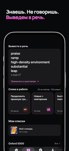
What the numbers say: Wispy: Разговорный английский runs a dark set with one background colour (#0C0C0C) carried across every screenshot — the listing reads as a single poster when the shots sit side by side in search results. The accent colour we picked up, #FC74DC, is the one to reuse for badges, arrows and highlighted words if you borrow this look. Hit Use this style to open the editor with these exact colours and drop your own screenshot in.
Notice the first screenshot in particular. It's the one users see in search results and on the product page, and it's where most apps spend their best caption and tightest design. Look at the proportion of background to phone, where the text sits, what one thing the image is trying to communicate.
Want to see how other Education apps approach the same problem? Browse more Education apps in the showcase.
Take what works into your own screenshots
Open LaunchShots and design your App Store & Google Play screenshots — pick a device frame, drop captions, ship in minutes. Free, in your browser.
Open the screenshot editor →Apps with a similar look
Closest background + accent colours among the listings we've analysed — useful when you want to see the same palette handled by a different team.