Screenshot changes — detected by LaunchShots
Screenshot style breakdown
Sampled from 6 of Chirpy Sort: Bird Color Puzzle's App Store screenshots — background, accent and theme, measured by LaunchShots (not something Apple publishes).
#ACC4D4 bg
#97ACBA
#941C4C accent
#111111 text
Screenshots


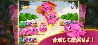


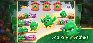
iPad screenshots


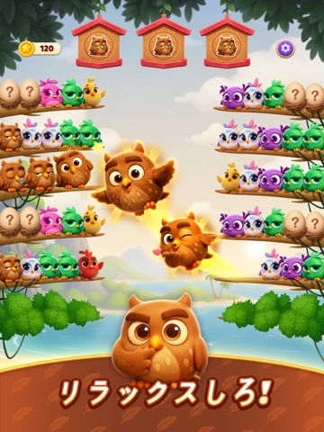
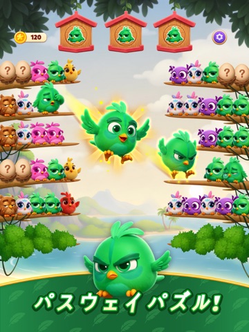


Icon palette
About this app
リラックスして耳を澄まし、幸せな小鳥たちと一日を明るく過ごしましょう! 『チャーピーソート』へようこそ。柔らかな色彩、心地よい音、元気いっぱいの可愛い小鳥が溢れる、楽しい並べ替えゲームです。 急ぐ必要もストレスもなく、ゆったりと並べ替えを楽しみ、穏やかな整理の喜びを感じられます。 小さな鳥の仲間たちをペアにしてあげましょう。羽ばたき、止まり、嬉しそうにさえずる姿を見て癒されます。 音や動き一つひとつが心を落ち着かせ、不思議と満足感が得られ、ずっとリラックスできます。 特徴 - 心地よい ASMR 音響と優しい鳥のさえずり - 触れると反応する、表情豊かで可愛い小鳥たち - 鮮やかで温かみのある、色彩豊かで魅力的なステージ - 指一本で簡単操作。遊びやすく、誰もが夢中になれる - 整理好きな方にぴったりな、整然とした達成感 - タイムリミットも制限もなし。自分のペースでゆったりプレイ
App details
What you can learn from Chirpy Sort: Bird Color Puzzle
Every shipping app on the App Store has gone through the same decisions you're working through right now: which screenshot goes first, what caption sits over it, which device frame to show, what color the background should be. The 20 screenshots above are Chirpy Sort: Bird Color Puzzle's answers to those questions — they're public, they're real, and they made it through Apple's review.
What the numbers say: Chirpy Sort: Bird Color Puzzle runs a mixed light-and-dark set where the background shifts from screenshot to screenshot (first shot #ACC4D4) — each image has to stand on its own, so the captions carry more of the story. The accent colour we picked up, #941C4C, is the one to reuse for badges, arrows and highlighted words if you borrow this look. Hit Use this style to open the editor with these exact colours and drop your own screenshot in.
Notice the first screenshot in particular. It's the one users see in search results and on the product page, and it's where most apps spend their best caption and tightest design. Look at the proportion of background to phone, where the text sits, what one thing the image is trying to communicate.
Want to see how other Games apps approach the same problem? Browse more Games apps in the showcase.
Take what works into your own screenshots
Open LaunchShots and design your App Store & Google Play screenshots — pick a device frame, drop captions, ship in minutes. Free, in your browser.
Open the screenshot editor →Apps with a similar look
Closest background + accent colours among the listings we've analysed — useful when you want to see the same palette handled by a different team.