Chart position — tracked daily by LaunchShots
Screenshot changes — detected by LaunchShots
Screenshot style breakdown
Sampled from 6 of MotoMeteo: Motorbike Weather's App Store screenshots — background, accent and theme, measured by LaunchShots (not something Apple publishes).
#141414 bg
#343434
#BCF404 accent
#FFFFFF text
Reading the caption text from the screenshots in your browser…
Screenshots

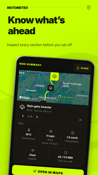


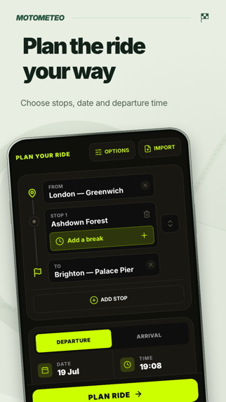
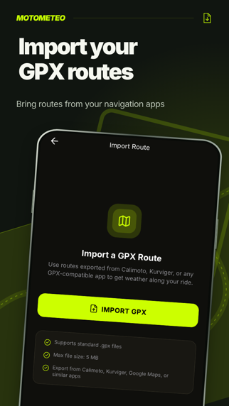


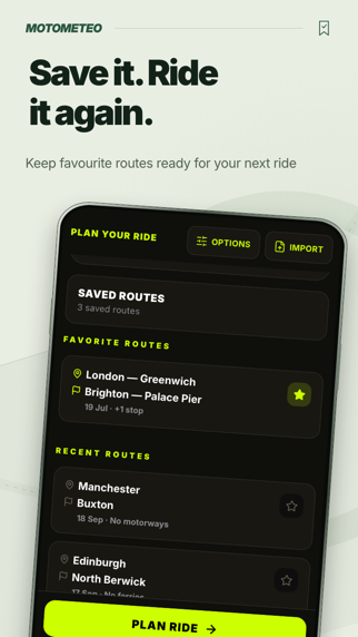
iPad screenshots





Icon palette
About this app
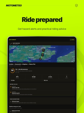
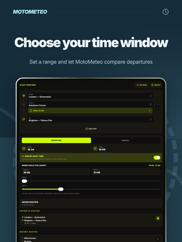
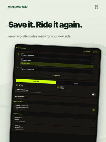
Know the weather for your whole motorbike ride before you leave. MotoMeteo shows rain, wind and temperature along your route, timed to when you expect to reach each stretch of road. Use the map and weather charts to see where conditions change on your commute, weekend ride or motorbike tour. Prepare for the road ahead • See where rain is forecast so you can have your waterproofs ready. • Check wind, gusts and visibility along your planned route. • Choose what to wear with guidance on how the temperature may feel while riding. • Review guidance on sun glare and ice risk before leaving. Your route, ready to ride Choose your start, destination and departure time. Add stops or import a GPX route to check the weather for a ride you've already planned. Save favourite routes, share the plan with your riding group and open the route in your navigation app. Add your next route and check th…
App details
What you can learn from MotoMeteo: Motorbike Weather
Every shipping app on the App Store has gone through the same decisions you're working through right now: which screenshot goes first, what caption sits over it, which device frame to show, what color the background should be. The 20 screenshots above are MotoMeteo: Motorbike Weather's answers to those questions — they're public, they're real, and they made it through Apple's review.
What the numbers say: MotoMeteo: Motorbike Weather runs a mixed light-and-dark set where the background shifts from screenshot to screenshot (first shot #141414) — each image has to stand on its own, so the captions carry more of the story. The accent colour we picked up, #BCF404, is the one to reuse for badges, arrows and highlighted words if you borrow this look. Hit Use this style to open the editor with these exact colours and drop your own screenshot in.
Notice the first screenshot in particular. It's the one users see in search results and on the product page, and it's where most apps spend their best caption and tightest design. Look at the proportion of background to phone, where the text sits, what one thing the image is trying to communicate.
Want to see how other Weather apps approach the same problem? Browse more Weather apps in the showcase.
Take what works into your own screenshots
Open LaunchShots and design your App Store & Google Play screenshots — pick a device frame, drop captions, ship in minutes. Free, in your browser.
Open the screenshot editor →Apps with a similar look
Closest background + accent colours among the listings we've analysed — useful when you want to see the same palette handled by a different team.