Chart position — tracked daily by LaunchShots
Screenshot style breakdown
Sampled from 6 of Khushu: Prière & Temps d'écran's App Store screenshots — background, accent and theme, measured by LaunchShots (not something Apple publishes).
#040404 bg
#272727
#245C4C accent
#FFFFFF text
Reading the caption text from the screenshots in your browser…
Screenshots



Icon palette
About this app
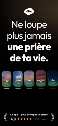
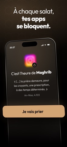
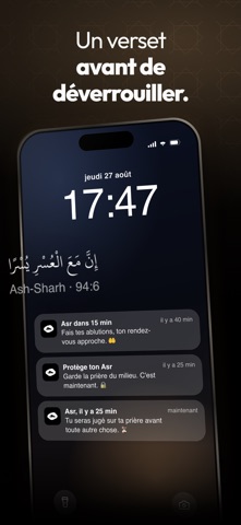
Mieux qu'un simple rappel de prière, Khushu protège le moment où tu pries. Cinq prières par jour. Ce n'est pas le temps qui manque, c'est le téléphone qui passe devant. Khushu bloque les apps qui te retiennent à l'heure de la salat, garde le Coran à portée de main, et te montre jour après jour ce que tu tiens vraiment. 4,8 étoiles sur l'App Store, plus de 560 avis. « Cette application permet de se déconnecter de notre téléphone dans des moments où notre Créateur nous appelle. » « J'aime cette application car elle m'aide à prier à l'heure. » « Moi qui avais arrêté la prière, elle va vraiment m'aider. » « Très bonne application, m'a permis de revenir dans le chemin de la droiture. » CE QUE ÇA CHANGE Tu ne repousses plus la prière à « après cette vidéo » Tu pries à l'heure au lieu de tout rattraper le soir Tu te lèves vraiment pour le Fajr Tu lis le Coran sans changer d'app Tes proches…
App details
What you can learn from Khushu: Prière & Temps d'écran
Every shipping app on the App Store has gone through the same decisions you're working through right now: which screenshot goes first, what caption sits over it, which device frame to show, what color the background should be. The 9 screenshots above are Khushu: Prière & Temps d'écran's answers to those questions — they're public, they're real, and they made it through Apple's review.
What the numbers say: Khushu: Prière & Temps d'écran runs a dark set with one background colour (#040404) carried across every screenshot — the listing reads as a single poster when the shots sit side by side in search results. The accent colour we picked up, #245C4C, is the one to reuse for badges, arrows and highlighted words if you borrow this look. Hit Use this style to open the editor with these exact colours and drop your own screenshot in.
Notice the first screenshot in particular. It's the one users see in search results and on the product page, and it's where most apps spend their best caption and tightest design. Look at the proportion of background to phone, where the text sits, what one thing the image is trying to communicate.
Want to see how other Lifestyle apps approach the same problem? Browse more Lifestyle apps in the showcase.
Take what works into your own screenshots
Open LaunchShots and design your App Store & Google Play screenshots — pick a device frame, drop captions, ship in minutes. Free, in your browser.
Open the screenshot editor →Apps with a similar look
Closest background + accent colours among the listings we've analysed — useful when you want to see the same palette handled by a different team.