Chart position — tracked daily by LaunchShots
Screenshot style breakdown
Sampled from 6 of Aurora Hunter: Aurora Boreale's App Store screenshots — background, accent and theme, measured by LaunchShots (not something Apple publishes).
#040404 bg
#272727
#044C44 accent
#FFFFFF text
- #1Mappe in tempo reale, LI i previsioni e spot migliori - : / 15:13,
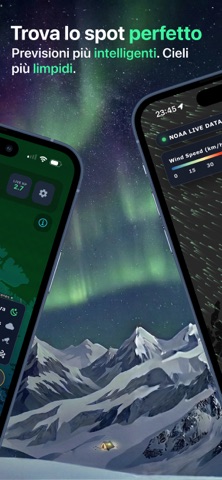
- #2Trova lo spot perfetto Previsioni più intelligenti. Cieli
- #3Mappa del Modelli NOAA | 4 integrati
- #4Probabilita di avvistamento | realistiche i
- #5KIRUNA . - : Forecast x
Captions read from the screenshots (OCR, may contain small errors): 5 headlines, 8.2 words on average (longest 14).
Screenshots



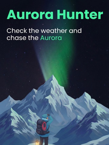
iPad screenshots


Icon palette
About this app
Stai cercando l’aurora boreale? Aurora Hunter ti aiuta a decidere quando uscire e dove guardare. Riunisce attività aurorale, nuvolosità, meteo locale, vento, webcam live, dati di space weather e segnalazioni della community in un’unica app. PIANIFICA IN BASE AL CIELO REALE Anche un’aurora intensa può restare invisibile sotto le nuvole o con troppa luce. Controlla copertura nuvolosa, meteo, vento e condizioni di luce prima di partire. PREVISIONI AURORA & MAPPA LIVE Segui l’ovale aurorale e l’attività locale. Confronta le condizioni attorno alla tua posizione e capisci se l’attività sta aumentando vicino a te. SPACE WEATHER, SENZA BASARTI SU UN SOLO NUMERO Segui indice KP, velocità del vento solare, densità delle particelle e Bz. Usali come contesto insieme alle condizioni del cielo locale. TROVA CIELI PIÙ SERENI Usa le mappe di nuvole e vento per capire dove potrebbero aprirsi schia…
App details
What you can learn from Aurora Hunter: Aurora Boreale
Every shipping app on the App Store has gone through the same decisions you're working through right now: which screenshot goes first, what caption sits over it, which device frame to show, what color the background should be. The 12 screenshots above are Aurora Hunter: Aurora Boreale's answers to those questions — they're public, they're real, and they made it through Apple's review.
What the numbers say: Aurora Hunter: Aurora Boreale runs a dark set where the background shifts from screenshot to screenshot (first shot #040404) — each image has to stand on its own, so the captions carry more of the story. The accent colour we picked up, #044C44, is the one to reuse for badges, arrows and highlighted words if you borrow this look. Hit Use this style to open the editor with these exact colours and drop your own screenshot in.
Notice the first screenshot in particular. It's the one users see in search results and on the product page, and it's where most apps spend their best caption and tightest design. Look at the proportion of background to phone, where the text sits, what one thing the image is trying to communicate.
Want to see how other Weather apps approach the same problem? Browse more Weather apps in the showcase.
Take what works into your own screenshots
Open LaunchShots and design your App Store & Google Play screenshots — pick a device frame, drop captions, ship in minutes. Free, in your browser.
Open the screenshot editor →Apps with a similar look
Closest background + accent colours among the listings we've analysed — useful when you want to see the same palette handled by a different team.