Chart position — tracked daily by LaunchShots
Screenshot changes — detected by LaunchShots
Screenshot style breakdown
Sampled from 6 of みあケア 気圧予報と頭痛記録・体調管理's App Store screenshots — background, accent and theme, measured by LaunchShots (not something Apple publishes).
#FCFCFC bg
#DDDDDD
#FCE48C accent
#111111 text
Screenshots


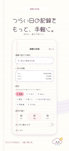


iPad screenshots


Icon palette
About this app
気圧の変化が気になる日に、明日の予定を少し整える。 みあケアは、気圧予報と頭痛記録をまとめて確認できる体調管理アプリです。Apple Watchがなくても、気圧予報と頭痛の記録を使えます。 ◆ 気圧の変化を先に確認 今日・明日の気圧予報、グラフ、注意する時間帯を確認できます。気圧の変化に応じた通知で、予定を考えるときのめやすに。 ◆ あすのそなえ 明日の予報とこれまでの頭痛記録の傾向を、短い見通しにまとめます。予報データが足りない場合は表示されません。 ◆ 頭痛を記録して振り返る 症状、強さ、服薬の有無、きっかけ、メモを記録。同じ日に複数回の頭痛を記録でき、記録時に取得できる気圧も一緒に残せます。 ◆ からだの傾向を知る 対応するApple Watchやヘルスケアのデータを使い、ストレスのめやす、睡眠、活動量、記録の傾向を確認できます。表示できる内容は端末・取得できるデータ・許可設定によって異なります。 ◆ 日々のセルフケアに 深呼吸ガイド、ホーム画面のウィジェット、Apple Watchでの表示にも対応しています。 ◆ 無料とPremium …
App details
What you can learn from みあケア 気圧予報と頭痛記録・体調管理
Every shipping app on the App Store has gone through the same decisions you're working through right now: which screenshot goes first, what caption sits over it, which device frame to show, what color the background should be. The 13 screenshots above are みあケア 気圧予報と頭痛記録・体調管理's answers to those questions — they're public, they're real, and they made it through Apple's review.
What the numbers say: みあケア 気圧予報と頭痛記録・体調管理 runs a light set with one background colour (#FCFCFC) carried across every screenshot — the listing reads as a single poster when the shots sit side by side in search results. The accent colour we picked up, #FCE48C, is the one to reuse for badges, arrows and highlighted words if you borrow this look. Hit Use this style to open the editor with these exact colours and drop your own screenshot in.
Notice the first screenshot in particular. It's the one users see in search results and on the product page, and it's where most apps spend their best caption and tightest design. Look at the proportion of background to phone, where the text sits, what one thing the image is trying to communicate.
Want to see how other Weather apps approach the same problem? Browse more Weather apps in the showcase.
Take what works into your own screenshots
Open LaunchShots and design your App Store & Google Play screenshots — pick a device frame, drop captions, ship in minutes. Free, in your browser.
Open the screenshot editor →Apps with a similar look
Closest background + accent colours among the listings we've analysed — useful when you want to see the same palette handled by a different team.