Chart position — tracked daily by LaunchShots
Screenshot changes — detected by LaunchShots
Screenshot style breakdown
Sampled from 6 of Nootro's App Store screenshots — background, accent and theme, measured by LaunchShots (not something Apple publishes).
#040404 bg
#272727
#445C74 accent
#FFFFFF text
Screenshots




Icon palette
About this app
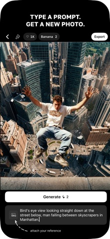
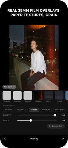
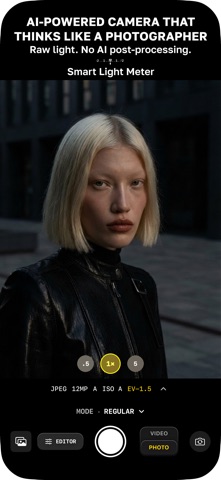
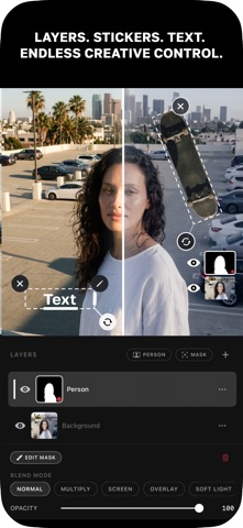
Профессиональное редактирование фото и ИИ — в одном приложении. Создано авторами для авторов. Снимаете стрит-фотографию или делаете контент для соцсетей — в Nootro есть всё: продвинутая ручная камера с умным экспонометром, мощные AI-фильтры и инструменты, профессиональный редактор с кривыми, HSL, слоями, стикерами и цветокоррекцией. Снимайте лучше. Редактируйте умнее. Опыт не нужен. УМНАЯ КАМЕРА • Встроенный экспонометр с анализом экспозиции в реальном времени • Съёмка в RAW — несжатые файлы без постобработки, в отличие от стандартной камеры • Ручное управление: ISO, выдержка, баланс белого, фокус • ИИ-подсказка композиции — помогает выстроить идеальный кадр • Фронтальная и основная камеры • Пресеты — профессиональный вид в одно касание • Создавайте, экспортируйте и импортируйте собственные пресеты ИИ-ИНСТРУМЕНТЫ • AI Editor — опишите, что хотите, и ИИ преобразит фото • AI Filters — …
App details
What you can learn from Nootro
Every shipping app on the App Store has gone through the same decisions you're working through right now: which screenshot goes first, what caption sits over it, which device frame to show, what color the background should be. The 8 screenshots above are Nootro's answers to those questions — they're public, they're real, and they made it through Apple's review.
What the numbers say: Nootro runs a dark set with one background colour (#040404) carried across every screenshot — the listing reads as a single poster when the shots sit side by side in search results. The accent colour we picked up, #445C74, is the one to reuse for badges, arrows and highlighted words if you borrow this look. Hit Use this style to open the editor with these exact colours and drop your own screenshot in.
Notice the first screenshot in particular. It's the one users see in search results and on the product page, and it's where most apps spend their best caption and tightest design. Look at the proportion of background to phone, where the text sits, what one thing the image is trying to communicate.
Want to see how other Photo & Video apps approach the same problem? Browse more Photo & Video apps in the showcase.
Take what works into your own screenshots
Open LaunchShots and design your App Store & Google Play screenshots — pick a device frame, drop captions, ship in minutes. Free, in your browser.
Open the screenshot editor →Apps with a similar look
Closest background + accent colours among the listings we've analysed — useful when you want to see the same palette handled by a different team.