Chart position — tracked daily by LaunchShots
Screenshot style breakdown
Sampled from 6 of 螺丝多多-螺丝真好玩's App Store screenshots — background, accent and theme, measured by LaunchShots (not something Apple publishes).
#84CCF4 bg
#74B3D6
#FCBC9C accent
#111111 text
Screenshots



Icon palette
About this app
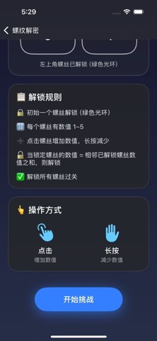
一款将螺丝元素与创新玩法完美融合的高级解谜游戏合集。我们精心设计了三种截然不同的游戏模式,每一种都以螺丝为核心,带来独一无二的沉浸式体验。无论你是喜欢策略思考、快速反应,还是物理模拟,都能在这里找到属于自己的乐趣。 【螺丝密钥】 解锁螺丝,挑战逻辑!在方形网格中,每个螺丝都有一个可调整的数值(1~5),并且与相邻螺丝相连。初始只有一个螺丝解锁,你需要通过单击增加、长按减少,调整未解锁螺丝的数值,使其等于所有相邻已解锁螺丝的数值之和——满足条件时螺丝会华丽解锁并闪耀光芒。随着网格从2x2扩展到3x3,数值关系愈发复杂,需要你精心规划顺序,最终让所有螺丝点亮。金属质感渲染、发光连线、解锁特效,带来沉浸式解谜体验! 【螺丝陨落】 专注力大考验!螺丝从屏幕上方不断下落,并在过程中随机变换形状。你需要紧盯目标形状,在正确的时机点击收集。误点或漏接都会消耗生命值。游戏界面简洁明快,金属螺丝配上发光形状线条,视觉冲击力强。难度随关卡提升:下落速度加快、形状变化频率增加、目标数量增多,挑战你的手眼协调与瞬间判断力! …
App details
What you can learn from 螺丝多多-螺丝真好玩
Every shipping app on the App Store has gone through the same decisions you're working through right now: which screenshot goes first, what caption sits over it, which device frame to show, what color the background should be. The 7 screenshots above are 螺丝多多-螺丝真好玩's answers to those questions — they're public, they're real, and they made it through Apple's review.
What the numbers say: 螺丝多多-螺丝真好玩 runs a mixed light-and-dark set where the background shifts from screenshot to screenshot (first shot #84CCF4) — each image has to stand on its own, so the captions carry more of the story. The accent colour we picked up, #FCBC9C, is the one to reuse for badges, arrows and highlighted words if you borrow this look. Hit Use this style to open the editor with these exact colours and drop your own screenshot in.
Notice the first screenshot in particular. It's the one users see in search results and on the product page, and it's where most apps spend their best caption and tightest design. Look at the proportion of background to phone, where the text sits, what one thing the image is trying to communicate.
Want to see how other Games apps approach the same problem? Browse more Games apps in the showcase.
Take what works into your own screenshots
Open LaunchShots and design your App Store & Google Play screenshots — pick a device frame, drop captions, ship in minutes. Free, in your browser.
Open the screenshot editor →Apps with a similar look
Closest background + accent colours among the listings we've analysed — useful when you want to see the same palette handled by a different team.