Screenshot style breakdown
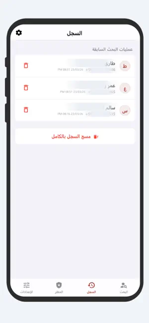
Sampled from 6 of كاشف الارقام اليمنية والحظر's App Store screenshots — background, accent and theme, measured by LaunchShots (not something Apple publishes).
#F4F4FC bg
#D6D6DD
#AC342C accent
#111111 text
Reading the caption text from the screenshots in your browser…
Screenshots

Icon palette
About this app
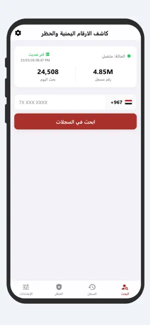
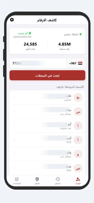
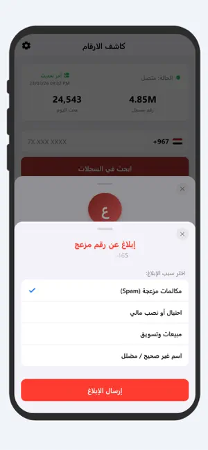
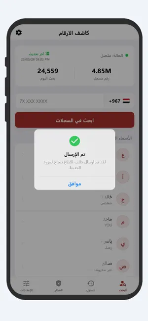
هل تعاني من المكالمات المزعجة والأرقام المجهولة؟ تطبيق "كاشف الأرقام اليمنية" هو دليلك الذكي والأسرع لمعرفة هوية المتصل واكتشاف الأرقام بكل سهولة وأمان. صُمم التطبيق خصيصاً ليتوافق مع بيئة وتصميم نظام iOS، ليقدم لك تجربة مستخدم سلسة، سريعة، وخالية من التعقيد، مع قاعدة بيانات ضخمة ومُحدثة باستمرار تغطي جميع شبكات الاتصالات في اليمن (يمن موبايل، YOU، سبأفون، وواي). المميزات الرئيسية: - بحث فائق السرعة: أدخل أي رقم يمني واكتشف الأسماء المرتبطة به في ثوانٍ معدودة. - تحديد مزود الخدمة تلقائياً: يعرض لك التطبيق شبكة الاتصال الخاصة بالرقم بمجرد البحث عنه. - النشاط العالمي للحظر (مباشر): شاشة تفاعلية تتيح لك متابعة الأرقام التي يتم الإبلاغ عنها أو حظرها من قبل المستخدمين الآخرين لحظة بلحظة. - حماية المجتمع (الإبلاغ الذكي): ساهم في حماية الآخرين من خلال الإبلاغ عن الأرقام المزعجة، الاحتيالية، أو مسوقي المبيعات بضغطة زر واحدة. - سجل بحث متكامل: يحتفظ التطبيق بسجل عمليات البحث الخاصة بك محلياً ل…
App details
What you can learn from كاشف الارقام اليمنية والحظر
Every shipping app on the App Store has gone through the same decisions you're working through right now: which screenshot goes first, what caption sits over it, which device frame to show, what color the background should be. The 6 screenshots above are كاشف الارقام اليمنية والحظر's answers to those questions — they're public, they're real, and they made it through Apple's review.
What the numbers say: كاشف الارقام اليمنية والحظر runs a light set with one background colour (#F4F4FC) carried across every screenshot — the listing reads as a single poster when the shots sit side by side in search results. The accent colour we picked up, #AC342C, is the one to reuse for badges, arrows and highlighted words if you borrow this look. Hit Use this style to open the editor with these exact colours and drop your own screenshot in.
Notice the first screenshot in particular. It's the one users see in search results and on the product page, and it's where most apps spend their best caption and tightest design. Look at the proportion of background to phone, where the text sits, what one thing the image is trying to communicate.
Want to see how other Productivity apps approach the same problem? Browse more Productivity apps in the showcase.
Take what works into your own screenshots
Open LaunchShots and design your App Store & Google Play screenshots — pick a device frame, drop captions, ship in minutes. Free, in your browser.
Open the screenshot editor →Apps with a similar look
Closest background + accent colours among the listings we've analysed — useful when you want to see the same palette handled by a different team.