Chart position — tracked daily by LaunchShots
Screenshot style breakdown
Sampled from 6 of انجاز المعلم - تحضير الدروس's App Store screenshots — background, accent and theme, measured by LaunchShots (not something Apple publishes).
#6C74DC bg
#8087E0
#446C7C accent
#FFFFFF text
Screenshots


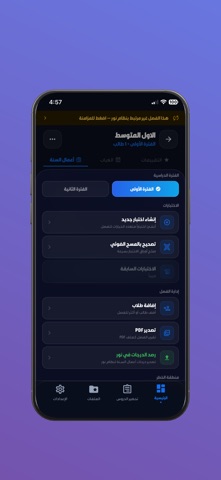
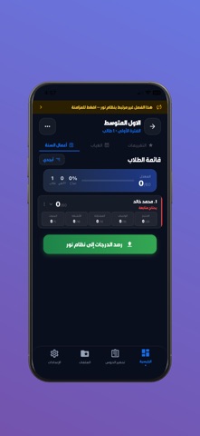


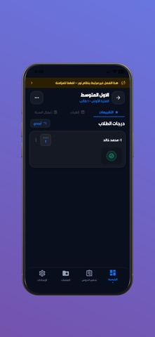

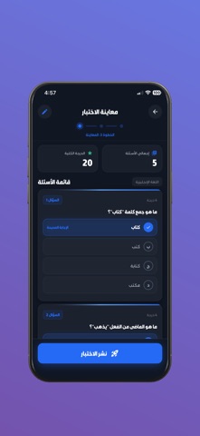
iPad screenshots


Icon palette
About this app
إنجاز للمعلم هو التطبيق المتكامل لإدارة الفصل الدراسي، مصمم خصيصاً للمعلمين في المملكة العربية السعودية مع تكامل كامل مع منصة نور. وفّر وقتك، وقلّل الأعمال الورقية، وركّز على ما يهم — طلابك. تقييم الطلاب ورصد الدرجات قيّم طلابك وسجّل درجاتهم بسهولة وسرعة. تابع أداء كل طالب وحدد من يحتاج دعماً إضافياً في ثوانٍ معدودة. تحضير الدروس والجداول الأسبوعية خطط لدروسك ونظّم جدولك الأسبوعي بكل يسر. ابقَ دائماً متقدماً خطوة على جدولك. التقارير والإحصائيات احصل على تحليلات فورية لأداء فصلك. أنشئ تقارير مفصّلة تساعدك على اتخاذ قرارات تعليمية أفضل. الشهادات والتقارير بصيغة PDF أنشئ شهادات طلابية احترافية وتقارير PDF بضغطة واحدة، وشاركها فوراً مع أولياء الأمور أو إدارة المدرسة. إنشاء الاختبارات وتصحيحها صمّم اختباراتك وصحّحها مباشرةً من التطبيق. لا مزيد من الأوراق — كل شيء رقمي ومنظّم. التكامل مع منصة نور سجّل درجات الطلاب وزامنها مباشرةً مع منصة نور. إنجاز للمعلم يربط فصلك الدراسي بالنظام التعليمي ال…
App details
What you can learn from انجاز المعلم - تحضير الدروس
Every shipping app on the App Store has gone through the same decisions you're working through right now: which screenshot goes first, what caption sits over it, which device frame to show, what color the background should be. The 17 screenshots above are انجاز المعلم - تحضير الدروس's answers to those questions — they're public, they're real, and they made it through Apple's review.
What the numbers say: انجاز المعلم - تحضير الدروس runs a dark set with one background colour (#6C74DC) carried across every screenshot — the listing reads as a single poster when the shots sit side by side in search results. The accent colour we picked up, #446C7C, is the one to reuse for badges, arrows and highlighted words if you borrow this look. Hit Use this style to open the editor with these exact colours and drop your own screenshot in.
Notice the first screenshot in particular. It's the one users see in search results and on the product page, and it's where most apps spend their best caption and tightest design. Look at the proportion of background to phone, where the text sits, what one thing the image is trying to communicate.
Want to see how other Education apps approach the same problem? Browse more Education apps in the showcase.
Take what works into your own screenshots
Open LaunchShots and design your App Store & Google Play screenshots — pick a device frame, drop captions, ship in minutes. Free, in your browser.
Open the screenshot editor →Apps with a similar look
Closest background + accent colours among the listings we've analysed — useful when you want to see the same palette handled by a different team.