Screenshot changes — detected by LaunchShots
Screenshot style breakdown
Sampled from 6 of EvSkor's App Store screenshots — background, accent and theme, measured by LaunchShots (not something Apple publishes).
#043CA4 bg
#2757B0
#8CDCF4 accent
#FFFFFF text
Reading the caption text from the screenshots in your browser…
Screenshots

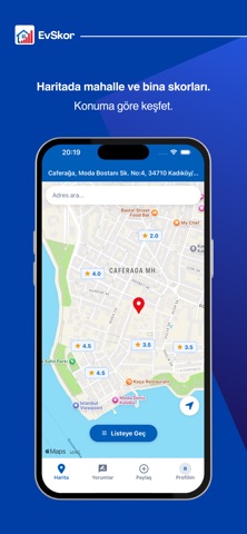


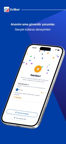
iPad screenshots


Icon palette
About this app
Taşınmadan önce sadece ilana değil, o evde yaşayanlara da bak. EvSkor, kiracıların yaşadıkları deneyimleri anonim olarak paylaştığı; ev, apartman ve mahalle hakkında gerçek kullanıcı yorumlarını harita üzerinden keşfedebileceğin bir platformdur. Bir evin fotoğrafları her şeyi göstermez. Gürültü, komşuluk, bina yönetimi, aidat, yalıtım, güvenlik veya ev sahibiyle yaşanan deneyimler ancak orada yaşayanlardan öğrenilebilir. EvSkor ile bina ve mahalle hakkında kullanıcı yorumlarını okuyabilir, mahalle puanlarını karşılaştırabilir ve taşınmadan önce o bölgede yaşayanların ortak deneyimlerini özet halinde inceleyebilirsin. Özellikler • Harita üzerinden ev, apartman ve mahalle puanlarını görüntüle. • Gerçek kullanıcı yorumlarını ve fotoğraflı deneyimleri keşfet. • Mahalle hakkında kullanıcı yorumlarından oluşturulan özeti incele. • Mahallenin ilçedeki sıralamasını ve genel puanını görüntül…
App details
What you can learn from EvSkor
Every shipping app on the App Store has gone through the same decisions you're working through right now: which screenshot goes first, what caption sits over it, which device frame to show, what color the background should be. The 10 screenshots above are EvSkor's answers to those questions — they're public, they're real, and they made it through Apple's review.
What the numbers say: EvSkor runs a dark set with one background colour (#043CA4) carried across every screenshot — the listing reads as a single poster when the shots sit side by side in search results. The accent colour we picked up, #8CDCF4, is the one to reuse for badges, arrows and highlighted words if you borrow this look. Hit Use this style to open the editor with these exact colours and drop your own screenshot in.
Notice the first screenshot in particular. It's the one users see in search results and on the product page, and it's where most apps spend their best caption and tightest design. Look at the proportion of background to phone, where the text sits, what one thing the image is trying to communicate.
Want to see how other Utilities apps approach the same problem? Browse more Utilities apps in the showcase.
Take what works into your own screenshots
Open LaunchShots and design your App Store & Google Play screenshots — pick a device frame, drop captions, ship in minutes. Free, in your browser.
Open the screenshot editor →Apps with a similar look
Closest background + accent colours among the listings we've analysed — useful when you want to see the same palette handled by a different team.