Chart position — tracked daily by LaunchShots
Screenshot style breakdown
Sampled from 5 of Feddy – Keep Posting's App Store screenshots — background, accent and theme, measured by LaunchShots (not something Apple publishes).
#0C0C0C bg
#2E2E2E
#FCA444 accent
#FFFFFF text
Screenshots


Icon palette
About this app
Feddy помогает превратить публикации в привычку — по одному посту за раз. Найди идею, подготовь сценарий и расти вместе со своим стриком и маленьким котом. ИДЕИ ДЛЯ ТВОЕГО БЛОГА Попроси ИИ-помощника предложить идеи, подписи или сценарий короткого видео. Уточняй ответы, сохраняй понравившееся и отправляй готовый текст в суфлёр. ЧИТАЙ И СНИМАЙ Суфлёр показывает текст во время записи. Он помогает не забыть слова, но не попадает в сохранённое видео. ПРОГРЕСС ПЕРЕД ГЛАЗАМИ Смотри календарь публикаций, следи за стриком и добавляй заметки для планирования. Делись прогрессом с помощью персональной карточки. Заморозка может защитить один пропущенный день, не добавляя день к стрику. КОТ ВСЕГДА РЯДОМ Добавь виджет на главный экран. Настроение кота меняется в зависимости от публикаций и времени суток. Напоминания и, когда доступно, таймер на экране блокировки и в Dynamic Island помогут не забыт…
App details
What you can learn from Feddy – Keep Posting
Every shipping app on the App Store has gone through the same decisions you're working through right now: which screenshot goes first, what caption sits over it, which device frame to show, what color the background should be. The 5 screenshots above are Feddy – Keep Posting's answers to those questions — they're public, they're real, and they made it through Apple's review.
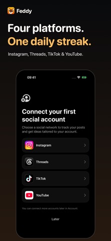
What the numbers say: Feddy – Keep Posting runs a dark set with one background colour (#0C0C0C) carried across every screenshot — the listing reads as a single poster when the shots sit side by side in search results. The accent colour we picked up, #FCA444, is the one to reuse for badges, arrows and highlighted words if you borrow this look. Hit Use this style to open the editor with these exact colours and drop your own screenshot in.
Notice the first screenshot in particular. It's the one users see in search results and on the product page, and it's where most apps spend their best caption and tightest design. Look at the proportion of background to phone, where the text sits, what one thing the image is trying to communicate.
Want to see how other Productivity apps approach the same problem? Browse more Productivity apps in the showcase.
Take what works into your own screenshots
Open LaunchShots and design your App Store & Google Play screenshots — pick a device frame, drop captions, ship in minutes. Free, in your browser.
Open the screenshot editor →Apps with a similar look
Closest background + accent colours among the listings we've analysed — useful when you want to see the same palette handled by a different team.