Chart position — tracked daily by LaunchShots
Screenshot changes — detected by LaunchShots
Screenshot style breakdown
Sampled from 6 of Mola相机's App Store screenshots — background, accent and theme, measured by LaunchShots (not something Apple publishes).
#FCF4EC bg
#DDD6CF
#EC3424 accent
#111111 text
Screenshots


iPad screenshots


Icon palette
About this app
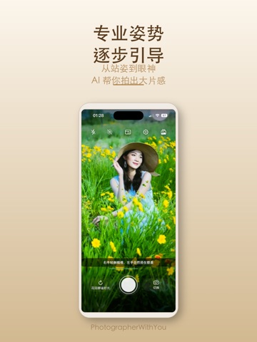
AI 帮你构图,调色盘帮你定调 拍照最难的从来不是按快门,而是两件事:这一张该怎么取景,以及它该是什么色调。Mola 相机把这两件事交给 AI 和一块实时调色盘。 ■ AI 构图辅助:拍之前就告诉你怎么站 点亮取景框里的金色星星,AI 实时识别画面里的重点,算出这一张该怎么取景。 屏幕上会出现一个白点和一个目标圆圈——移动手机,让白点和小圆圈重合,就完成了构图。对准之后金框锁定选区,自动变焦放大主体,不用你自己捏着屏幕试倍率。 人像和风景走的是两套引导逻辑:拍人时找人的位置和留白,拍风景时找主体、地平线和画面平衡。AI 还会告诉你它看到了什么样的场景、这一张为什么这么构图。手动选主体也支持:AI 选的不合你意,点一下自己圈。 录像时同样可用,全程只走镜头变焦,画面不会被裁糊。 ■ 调色盘:一块可以拖的颜色板 17 款调色盘,拖动二维色盘实时预览——横向换色调,纵向调浓淡,取景框里立刻跟着变,满意了直接按快门,保存下来就是你看到的样子,不用进修图软件再来一遍。 标准、珠光、金色、玫瑰金、琥珀色、冷调玫瑰金,以及奶油胶片、日…
App details
What you can learn from Mola相机
Every shipping app on the App Store has gone through the same decisions you're working through right now: which screenshot goes first, what caption sits over it, which device frame to show, what color the background should be. The 12 screenshots above are Mola相机's answers to those questions — they're public, they're real, and they made it through Apple's review.
What the numbers say: Mola相机 runs a light set with one background colour (#FCF4EC) carried across every screenshot — the listing reads as a single poster when the shots sit side by side in search results. The accent colour we picked up, #EC3424, is the one to reuse for badges, arrows and highlighted words if you borrow this look. Hit Use this style to open the editor with these exact colours and drop your own screenshot in.
Notice the first screenshot in particular. It's the one users see in search results and on the product page, and it's where most apps spend their best caption and tightest design. Look at the proportion of background to phone, where the text sits, what one thing the image is trying to communicate.
Want to see how other Photo & Video apps approach the same problem? Browse more Photo & Video apps in the showcase.
Take what works into your own screenshots
Open LaunchShots and design your App Store & Google Play screenshots — pick a device frame, drop captions, ship in minutes. Free, in your browser.
Open the screenshot editor →Apps with a similar look
Closest background + accent colours among the listings we've analysed — useful when you want to see the same palette handled by a different team.