Screenshot style breakdown
Sampled from 6 of おぼエル 運転免許の勉強's App Store screenshots — background, accent and theme, measured by LaunchShots (not something Apple publishes).
#04BC8C bg
#03A57B
#4C6C7C accent
#111111 text
Screenshots

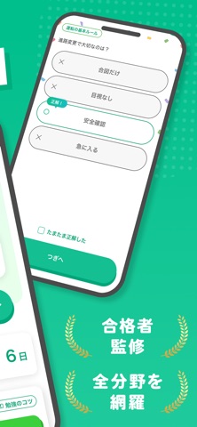
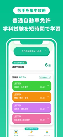


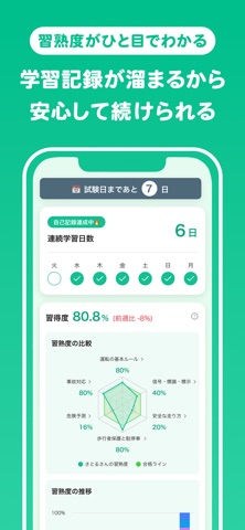

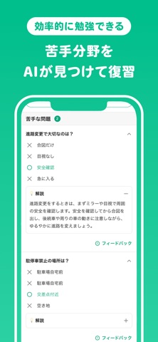
Icon palette
About this app
おぼエルは、運転免許・普通自動車免許の学科試験対策を、1問30秒の問題演習とAI復習で続けやすくする免許学習アプリです。 仮免、本免、効果測定に向けて、交通ルール、道路標識、安全確認、優先関係、運転者の義務などをスキマ時間に復習できます。正答率や学習履歴をもとに、苦手な分野を見つけて重点的に学習できます。 教習所や自動車学校での学習に合わせて、普通自動車免許の学科範囲をスマホで確認できます。仮免許の前に基礎を固めたい方、本免試験前に交通ルールを見直したい方、効果測定で間違えやすい分野を反復したい方に向けた問題演習を用意しています。 道路標識、標示、歩行者保護、危険予測、駐車・停車など、学科試験で問われやすいテーマを短い時間で復習できます。学習の記録を見ながら、苦手な交通ルールを少しずつ減らしていきましょう。 【おぼエルでできること】 ・普通自動車免許の学科試験対策 ・仮免、本免、効果測定に向けた基礎知識の復習 ・1問30秒から進められるクイズ形式の問題演習 ・AI復習と復習サイクルによる定着サポート …
App details
What you can learn from おぼエル 運転免許の勉強
Every shipping app on the App Store has gone through the same decisions you're working through right now: which screenshot goes first, what caption sits over it, which device frame to show, what color the background should be. The 8 screenshots above are おぼエル 運転免許の勉強's answers to those questions — they're public, they're real, and they made it through Apple's review.
What the numbers say: おぼエル 運転免許の勉強 runs a light set with one background colour (#04BC8C) carried across every screenshot — the listing reads as a single poster when the shots sit side by side in search results. The accent colour we picked up, #4C6C7C, is the one to reuse for badges, arrows and highlighted words if you borrow this look. Hit Use this style to open the editor with these exact colours and drop your own screenshot in.
Notice the first screenshot in particular. It's the one users see in search results and on the product page, and it's where most apps spend their best caption and tightest design. Look at the proportion of background to phone, where the text sits, what one thing the image is trying to communicate.
Want to see how other Education apps approach the same problem? Browse more Education apps in the showcase.
Take what works into your own screenshots
Open LaunchShots and design your App Store & Google Play screenshots — pick a device frame, drop captions, ship in minutes. Free, in your browser.
Open the screenshot editor →Apps with a similar look
Closest background + accent colours among the listings we've analysed — useful when you want to see the same palette handled by a different team.