Chart position — tracked daily by LaunchShots
Screenshot style breakdown
Sampled from 6 of バンドリ!アワーノーツ's App Store screenshots — background, accent and theme, measured by LaunchShots (not something Apple publishes).
#5C8CBC bg
#729CC5
#443C84 accent
#FFFFFF text
Screenshots




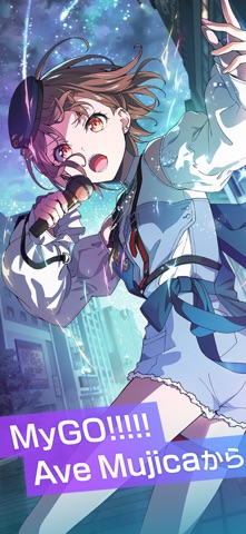
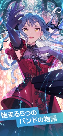
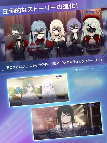
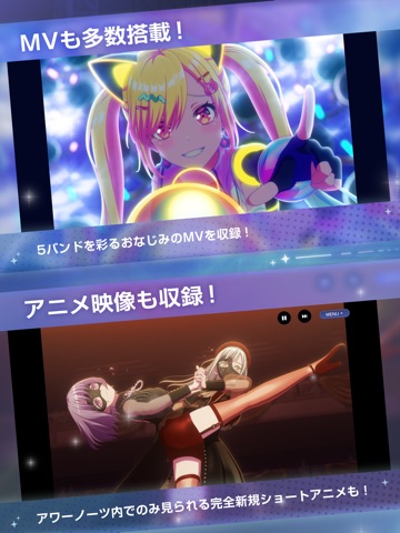
iPad screenshots



Icon palette
About this app
BanG Dream!(バンドリ!)プロジェクトがおくる最新モバイルゲーム『バンドリ!アワーノーツ』が撃奏リズム×アドベンチャーとして登場! 5つの新たなバンドが奏でる様々な楽曲と、新たに紡がれる重厚な物語をお楽しみください。 ■新たなリズムゲームシステム「撃奏ライブ」 リズムゲームのプレイ中に撃奏パートが登場! コンボ・タイミング・運要素など、あなたのリズムゲームの実力が試されるハラハラドキドキのリズムゲームへと進化! バンドリ!のリアルライブさながらの臨場感あふれるステージで、最大5人のパーティーゲーム感覚でリズムゲームを楽しめる! そして、アワーノーツだけの新システム「アシストモード」を搭載! リズムゲームが苦手な人でも気軽に、そして爽快にリズムゲームを楽しみながら誰でも上達! ■オリジナルソングから最新人気カバー楽曲まで広く収録 MyGO!!!!!・Ave Mujicaを始めとするバンドリ!アニメでおなじみのオリジナル楽曲から、人気カバー楽曲まで幅広く収録! 最新のヒット曲や、定番ソングなど、お気に入りの楽曲でプレイし…
App details
What you can learn from バンドリ!アワーノーツ
Every shipping app on the App Store has gone through the same decisions you're working through right now: which screenshot goes first, what caption sits over it, which device frame to show, what color the background should be. The 12 screenshots above are バンドリ!アワーノーツ's answers to those questions — they're public, they're real, and they made it through Apple's review.
What the numbers say: バンドリ!アワーノーツ runs a mixed light-and-dark set where the background shifts from screenshot to screenshot (first shot #5C8CBC) — each image has to stand on its own, so the captions carry more of the story. The accent colour we picked up, #443C84, is the one to reuse for badges, arrows and highlighted words if you borrow this look. Hit Use this style to open the editor with these exact colours and drop your own screenshot in.
Notice the first screenshot in particular. It's the one users see in search results and on the product page, and it's where most apps spend their best caption and tightest design. Look at the proportion of background to phone, where the text sits, what one thing the image is trying to communicate.
Want to see how other Games apps approach the same problem? Browse more Games apps in the showcase.
Take what works into your own screenshots
Open LaunchShots and design your App Store & Google Play screenshots — pick a device frame, drop captions, ship in minutes. Free, in your browser.
Open the screenshot editor →Apps with a similar look
Closest background + accent colours among the listings we've analysed — useful when you want to see the same palette handled by a different team.