Screenshot style breakdown
Sampled from 6 of Era Online: Şeref Savaşı's App Store screenshots — background, accent and theme, measured by LaunchShots (not something Apple publishes).
#0C0C14 bg
#2E2E34
#64C4FC accent
#FFFFFF text
Screenshots

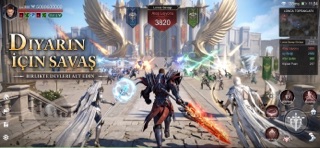
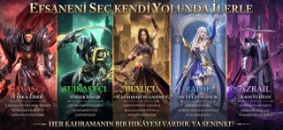


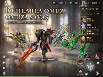
iPad screenshots


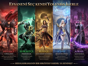
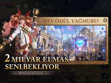

Icon palette
About this app
7 Ağustos saat 10:00'da büyük açılış! Hepinizi bekliyoruz! 100'den fazla deneyimli Türk YouTube ve TikTok içerik üreticisinin ortak tavsiyesi! ※ Açılış Ödülleri※ ※ Giriş Ödülü: Nadir Savaş Ruhu, Özel Unvan *1, Özel Binek *1 ve bol miktarda Altın! Muhteşem Açılış Hediyesi: 2 Milyar Elmaslık dev ödül havuzundan her gün dağıtım, ilk gelen kapar! ※ ÖN KAYIT AVANTAJLARI ※ Şimdi Ön Kayıt Yap, Ödülleri Kap! Hemen ön kayıt sürecine katıl, oyun açıldığında sana özel hazırlanan "Eksklusif Başlangıç Paketi" anında hesabına gelsin! 【OYUN ÖZELLİKLERİ 】 ※Türk Oyuncularına Özel Tasarım Tamamen Türkçe arayüz ve yerel seslendirme desteği! Türk oyun kültürüne ve alışkanlıklarına uygun, özel olarak tasarlanmış etkinlikler seni bekliyor. ※Yüzlerce Oyuncuyla Aynı Anda: Klan Savaşları Klanını kur veya bir ittifaka katıl! Dostlarınla omuz omuza vererek topraklar ile kaynaklar için çarpış; nefes kesen…
App details
What you can learn from Era Online: Şeref Savaşı
Every shipping app on the App Store has gone through the same decisions you're working through right now: which screenshot goes first, what caption sits over it, which device frame to show, what color the background should be. The 12 screenshots above are Era Online: Şeref Savaşı's answers to those questions — they're public, they're real, and they made it through Apple's review.
What the numbers say: Era Online: Şeref Savaşı runs a mixed light-and-dark set where the background shifts from screenshot to screenshot (first shot #0C0C14) — each image has to stand on its own, so the captions carry more of the story. The accent colour we picked up, #64C4FC, is the one to reuse for badges, arrows and highlighted words if you borrow this look. Hit Use this style to open the editor with these exact colours and drop your own screenshot in.
Notice the first screenshot in particular. It's the one users see in search results and on the product page, and it's where most apps spend their best caption and tightest design. Look at the proportion of background to phone, where the text sits, what one thing the image is trying to communicate.
Want to see how other Games apps approach the same problem? Browse more Games apps in the showcase.
Take what works into your own screenshots
Open LaunchShots and design your App Store & Google Play screenshots — pick a device frame, drop captions, ship in minutes. Free, in your browser.
Open the screenshot editor →Apps with a similar look
Closest background + accent colours among the listings we've analysed — useful when you want to see the same palette handled by a different team.