Chart position — tracked daily by LaunchShots
Screenshot changes — detected by LaunchShots
Screenshot style breakdown
Sampled from 6 of W三国志's App Store screenshots — background, accent and theme, measured by LaunchShots (not something Apple publishes).
#6C7CCC bg
#808ED3
#94DCFC accent
#FFFFFF text
Screenshots


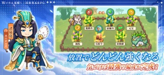

iPad screenshots
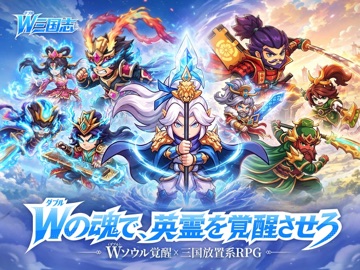


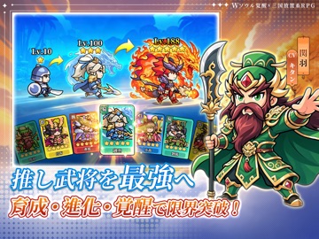


Icon palette
About this app
英霊と英雄――二つの魂が共存する、幻想の三国大陸。 運命に選ばれし主公よ、眠れる名将たちの失われた魂を取り戻し、共に新たなる「W(ダブル)三国」の旅へ踏み出そう。 ■三国武将、二つの姿で登場! その身に二つの魂を宿す強力な武将たちを呼び覚ませ。英雄か、英霊か。どちらの姿で戦うかは、君の采配次第!無双の強さで戦場に降り立ち、君だけの「二つの姿」を魅せつけろ! ■三国群雄、君の意のままに! 魏・蜀・呉・群雄の四大勢力が集結!三国志の武将60名以上が登場。 「ハズレ武将」は一切なし!育てれば、どの武将も主力として活躍できる! 育成・進化・覚醒で推しの武将をとことん育て上げ、自分だけの最強部隊で戦場を制覇しよう! ■お手軽放置で、サクッと強くなれ! 暇つぶしに最適!忙しい時のスキマ時間でも安心して遊べる放置ゲーム!オフライン中も大量の資源をサクサク獲得! 通勤中や休憩時間などのスキマ時間に、お手軽に「不労所得」のような快感を味わおう! ■仲間と力を合わせ、強敵に挑め! 軍団に加入し、仲間と共に敵軍を打ち破ろう…
App details
What you can learn from W三国志
Every shipping app on the App Store has gone through the same decisions you're working through right now: which screenshot goes first, what caption sits over it, which device frame to show, what color the background should be. The 12 screenshots above are W三国志's answers to those questions — they're public, they're real, and they made it through Apple's review.
What the numbers say: W三国志 runs a mixed light-and-dark set where the background shifts from screenshot to screenshot (first shot #6C7CCC) — each image has to stand on its own, so the captions carry more of the story. The accent colour we picked up, #94DCFC, is the one to reuse for badges, arrows and highlighted words if you borrow this look. Hit Use this style to open the editor with these exact colours and drop your own screenshot in.
Notice the first screenshot in particular. It's the one users see in search results and on the product page, and it's where most apps spend their best caption and tightest design. Look at the proportion of background to phone, where the text sits, what one thing the image is trying to communicate.
Want to see how other Games apps approach the same problem? Browse more Games apps in the showcase.
Take what works into your own screenshots
Open LaunchShots and design your App Store & Google Play screenshots — pick a device frame, drop captions, ship in minutes. Free, in your browser.
Open the screenshot editor →Apps with a similar look
Closest background + accent colours among the listings we've analysed — useful when you want to see the same palette handled by a different team.