Screenshot style breakdown
Sampled from 5 of Wanderland / ワンダーランド - 街を探検しよう's App Store screenshots — background, accent and theme, measured by LaunchShots (not something Apple publishes).
#F4F4D4 bg
#D6D6BA
#2CBCB4 accent
#111111 text
Screenshots




Icon palette
About this app
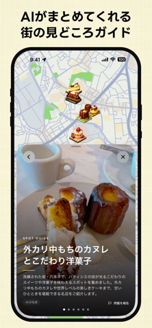
Wanderland(ワンダーランド)は、飲食店から公園、博物館まで、日本全国のさまざまなスポットの中から、あなたの「行きたい」が見つかる地図アプリです。 □ 地図で街を探検しよう ジオラマのように立ち上がる街並みを、アプリの中で散策しましょう。近くの見どころや話題のスポットが、どんどん目の前に現れます。眺めているだけで、次の行き先が自然と見つかります。 □ 「行きたい」を集めよう 気になった場所は、ワンタップでお気に入りにストック。まるで切り抜き帳のように、あとから見返せる、あなただけの「行きたいリスト」が成長していきます。 □ スポットの写真や動画を撮ろう スポットを実際に訪れたら、簡単操作で、写真や動画に記録。レポートを残せば残すほど、エリアの「足あとポイント」がたまっていきます。レベルを上げて、エリアマスターを目指しましょう!
App details
What you can learn from Wanderland / ワンダーランド - 街を探検しよう
Every shipping app on the App Store has gone through the same decisions you're working through right now: which screenshot goes first, what caption sits over it, which device frame to show, what color the background should be. The 5 screenshots above are Wanderland / ワンダーランド - 街を探検しよう's answers to those questions — they're public, they're real, and they made it through Apple's review.
What the numbers say: Wanderland / ワンダーランド - 街を探検しよう runs a light set with one background colour (#F4F4D4) carried across every screenshot — the listing reads as a single poster when the shots sit side by side in search results. The accent colour we picked up, #2CBCB4, is the one to reuse for badges, arrows and highlighted words if you borrow this look. Hit Use this style to open the editor with these exact colours and drop your own screenshot in.
Notice the first screenshot in particular. It's the one users see in search results and on the product page, and it's where most apps spend their best caption and tightest design. Look at the proportion of background to phone, where the text sits, what one thing the image is trying to communicate.
Want to see how other Lifestyle apps approach the same problem? Browse more Lifestyle apps in the showcase.
Take what works into your own screenshots
Open LaunchShots and design your App Store & Google Play screenshots — pick a device frame, drop captions, ship in minutes. Free, in your browser.
Open the screenshot editor →Apps with a similar look
Closest background + accent colours among the listings we've analysed — useful when you want to see the same palette handled by a different team.