Chart position — tracked daily by LaunchShots
Screenshot changes — detected by LaunchShots
Screenshot style breakdown
Sampled from 6 of AçıkSilivri's App Store screenshots — background, accent and theme, measured by LaunchShots (not something Apple publishes).
#F4F4FC bg
#D6D6DD
#4C649C accent
#111111 text
Reading the caption text from the screenshots in your browser…
Screenshots




Icon palette
About this app
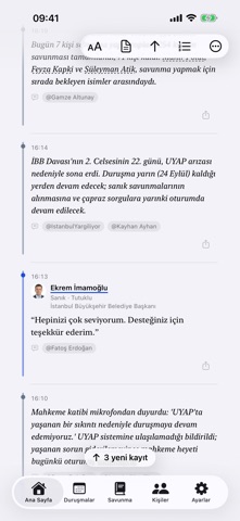
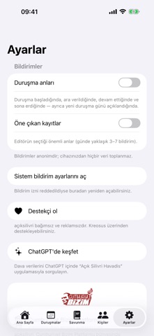
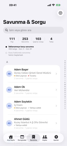
AçıkSilivri, İstanbul Büyükşehir Belediyesi (İBB) davasının her duruşma gününü duruşma salonundan takip etmenizi sağlayan bağımsız bir izleme aracıdır. Tüm içerik, kamuya açık duruşmalara ilişkin kaynak gösterilen bilgilere dayanır. • Canlı duruşma akışı — duruşma günü boyunca gelişmeler, ifadeler ve çapraz sorgular gerçek zamanlı olarak işlenir. • Okunaklı akış düzeni — konuşmacıya göre renklendirilmiş, kaynağıyla birlikte sunulan bir zaman çizelgesi. • Savunmalar ve çapraz sorgular — sanık ifadeleri ve soru-cevap akışları sistemli biçimde. • İddia — Savunma karşılaştırması ve iddianame içerikleri. • Kişiler — sanıklar, avukatlar ve duruşma katılımcılarının profilleri. • Anonim bildirimler — duruşma başladığında, ara verildiğinde ve sona erdiğinde haberdar olun. Ayrıca önemli ifadelerden de haberdar olabilirsiniz. AçıkSilivri bağımsız ve reklamsızdır; hiçbir kişisel veri toplamaz. ac…
App details
What you can learn from AçıkSilivri
Every shipping app on the App Store has gone through the same decisions you're working through right now: which screenshot goes first, what caption sits over it, which device frame to show, what color the background should be. The 10 screenshots above are AçıkSilivri's answers to those questions — they're public, they're real, and they made it through Apple's review.
What the numbers say: AçıkSilivri runs a light set with one background colour (#F4F4FC) carried across every screenshot — the listing reads as a single poster when the shots sit side by side in search results. The accent colour we picked up, #4C649C, is the one to reuse for badges, arrows and highlighted words if you borrow this look. Hit Use this style to open the editor with these exact colours and drop your own screenshot in.
Notice the first screenshot in particular. It's the one users see in search results and on the product page, and it's where most apps spend their best caption and tightest design. Look at the proportion of background to phone, where the text sits, what one thing the image is trying to communicate.
Want to see how other News apps approach the same problem? Browse more News apps in the showcase.
Take what works into your own screenshots
Open LaunchShots and design your App Store & Google Play screenshots — pick a device frame, drop captions, ship in minutes. Free, in your browser.
Open the screenshot editor →Apps with a similar look
Closest background + accent colours among the listings we've analysed — useful when you want to see the same palette handled by a different team.